Background
Inclusive design depends on a senior reviewer catching what would exclude someone. Can a low-vision user read this? Does the touch target work with motor impairment? Is this confusing for someone outside the power-user mental model? Those questions come up in senior reviews, late, after the design has shipped to engineering. Or they don't come up at all.
I built SYNTHIA so the knowledge that informs that review, accessibility standards, usability heuristics, the behavioral patterns of different users, sits in the canvas, before the bottleneck.
The original vision
Before I built anything, I designed the vision. A context-aware feedback system. The zoom level and the stage of the design would dictate the kind of feedback. Zoomed out at the artboard level, suggestion badges sat in the corner of each frame, summarizing what needed attention. Zoom in, and the feedback got more granular, specific patterns, specific traps, specific accessibility issues. An inline assistant at the bottom of the canvas tied it together, ask any question, get an answer in context.
This vision needed Figma to build it. Artboard-level badges, zoom-aware UI, a command bar woven into the canvas, that's Figma's surface, not a plugin's. The design was for a version of Figma that doesn't exist yet.
The bet
The plugin is different. A plugin can read the canvas, post comments, modify variables. It can't render UI at the zoom level you're working at or sit ambient in the canvas. The design problem became: how do you do context-aware feedback inside those limits.
I went with constraint. Instead of one open-ended assistant, five distinct evaluation lenses, each with a defined scope and a defined output.
A lot of AI design tools I'd seen were chasing personality, confidence, strong opinions. The instinct is to make the design voice loud, especially when it's sitting in a shared config alongside engineering ("always optimize for performance") and product ("always ship faster").
I tried the other way. SYNTHIA's findings don't push direction or argue for taste. They cite. WCAG 1.4.3. Heuristic #4. Trap #14.
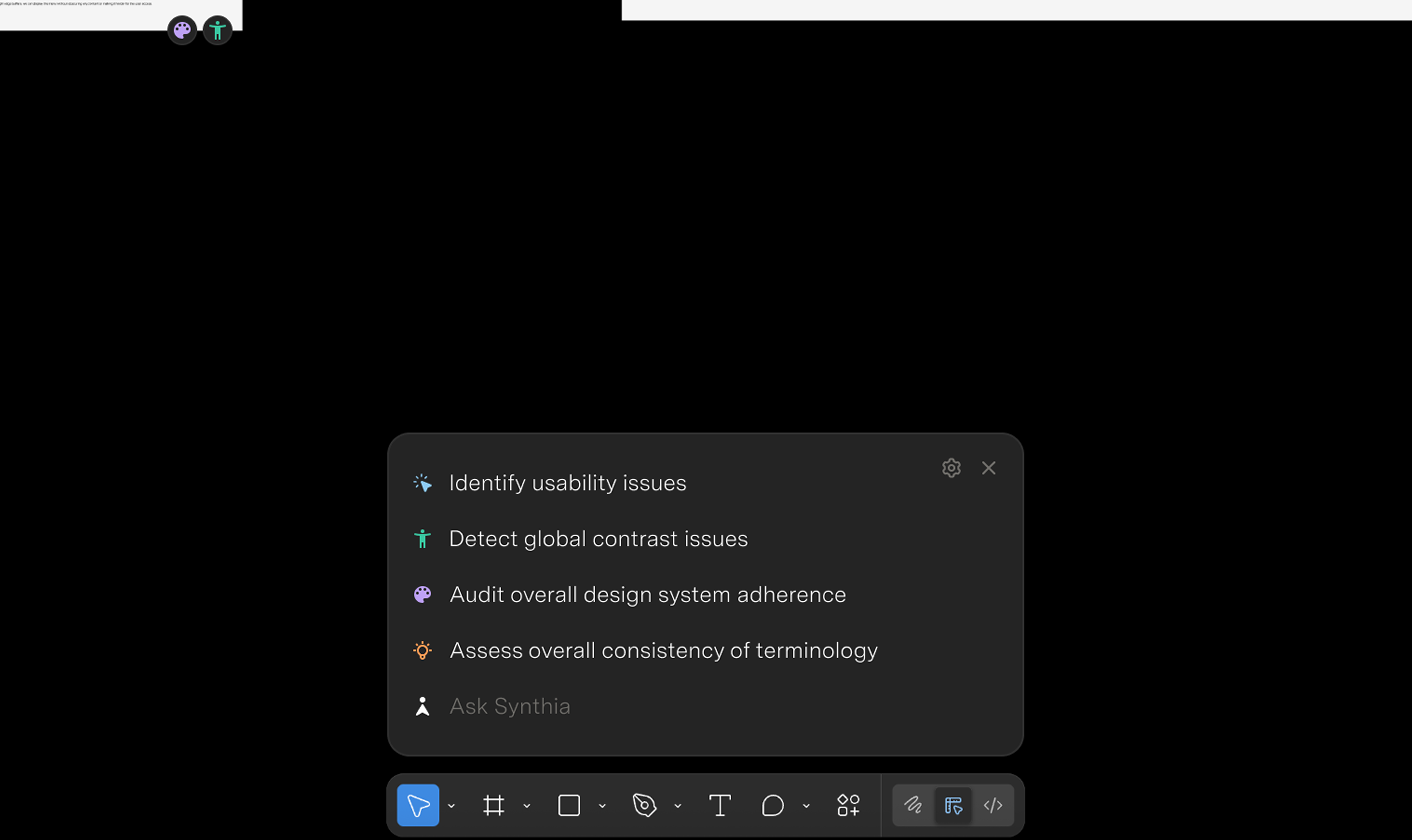
Five lenses
Select anything in Figma. SYNTHIA runs five evaluations against it.
Design system. Token usage, style adoption, missed component swaps. The mechanical stuff that's easy to fix and easy to miss.
Accessibility. WCAG 2.2 contrast, touch targets, font sizes. Math the browser can do.
Heuristics. Nielsen's ten. The classics, scoped to the element you selected, not a generic critique.
UI traps. I digitized the full Tenets & Traps card deck, twenty-six patterns, every one grounded in a real historical failure. Trap #6 (poor grouping) cites the 2000 butterfly ballot. Trap #1 (invisible element) cites Windows 8 removing the Start Menu.
Synthetic users. A knowledge worker and a student "read" your design and react in first person. "I see five sign-in options and I don't know which one is for me."
Fix or comment, never both
Mechanical issues, wrong token, contrast fail, font size off, get fixed directly in the document. Bind the variable, apply the style, set the value. One click per finding or batch the whole lot.
Judgment calls, heuristic violations, dark patterns, persona reactions, get posted as comments pinned to the exact node in the canvas.
How it's built
The first version was too eager. The model wanted to comment on everything, every visible element, even when there was nothing meaningful to say. It hallucinated standards, cited heuristics that didn't apply, made up rules that sounded plausible.
The 80% confidence threshold came first. If the model wasn't certain, it stayed quiet.
Then the citation requirement. Every finding had to point to a named standard or it didn't get to comment.
The three-tier triage was the last big shift. I noticed the model trying to use AI for contrast math, which the browser can do, or making calls about brand voice, which needs a human. I added new rules: tier one is math, tier two is pattern matching that needs context ("these buttons compete for attention"), tier three escalates to a human.
It runs on a four-layer prompt architecture so each constraint can change without breaking the others. Layer one is the rules every agent follows. Layer two is which lens you're acting as, an accessibility specialist talks differently than a Nielsen reviewer. Layer three is the reference material, the heuristics, the trap taxonomy, your design tokens. Layer four is the live Figma data.
The synthetic users lens needed its own tuning. Personas drift. The student kept sounding like a designer; the knowledge worker kept saying "this is intuitive" too much. I added behavioral anchors from real UXR findings about how each persona actually reads interfaces.
Questions for the DevEx team
SYNTHIA paired with a separate generation skill. Generation is the persuasive part, the one that pushes direction and aesthetic. SYNTHIA was the grounding part, referencing standards rather than stating preferences. The same shape, the triage, the citations, the four-layer prompt, applies to the next design skill in the library.
The bigger value wasn't the plugin. It was the architecture it tested for the skill library. I brought five questions to the DevEx team.
Where does a design skill live in an org-wide config? How do skills with different voices interact? Who governs taste versus standards? Can a skill escalate to humans instead of solving everything? How do we make sure design guidance gets heard over engineering and product rules?
The plugin was the way to test the framework with something concrete.
Outcomes
It won "Most Innovative" at Superhuman's global hackathon, 200+ entries. Got published to the org plugin library.
The synthetic users lens was the most divisive. Engineers liked it. Some designers found it uncomfortable, having a student tell you they don't get your sign-in screen feels personal.
What's next
The Figma plugin was the proof of concept. The hope is a consistent evaluation layer across the product lifecycle, same quality bar whether you're writing a spec, designing in Figma, reviewing code, or shipping to production. The engine ships next as a Claude skill and a Go agent.
Background
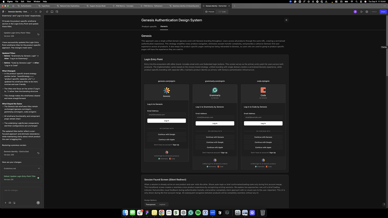
Right after the Coda acquisition, the identity team had one job: build id.superhuman.com, a single auth surface for all sign-in and sign-up traffic across Grammarly, Coda, and Superhuman Mail. We started before the brand existed.
The bet wasn't just unifying those three. The hope was a front door that could absorb the next acquisition without rework.
Research + architecture
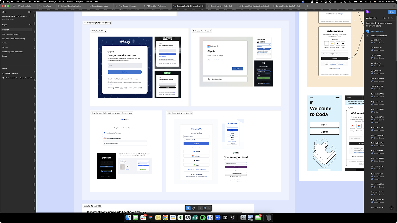
Before drawing anything I mapped how other multi-product platforms handle this, Disney, Microsoft, Meta, and Atlassian. Disney was the clearest influence: one email field that routes to the right place, white-labeled across brands. Atlassian was the closest structural model, same auth UI, branding switch per product.
The pattern across all four was the same. One front door. Email first. The system decides the path. The user is never asked to know which product their account lives in.
Grammarly's old flow went the other way. The password field appeared as soon as your cursor hit the email field, before the system knew if you had an account at all. Users were typing passwords for accounts that didn't exist. The new model inverts it, type your email once, the system figures out where you go, password comes last.
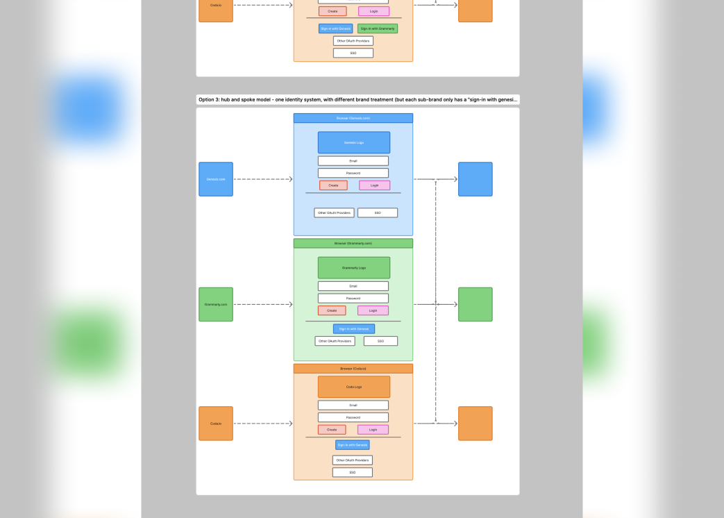
The architecture we landed on was hub-and-spoke, id.superhuman.com routes and serves each product brand, but brands can't talk to each other. I'd pushed for something more integrated; most traffic was going to Grammarly and a direct Grammarly-to-Coda path felt more natural than sending someone back up to the parent. Hub-and-spoke was the right call for where engineering was at the time.
Design
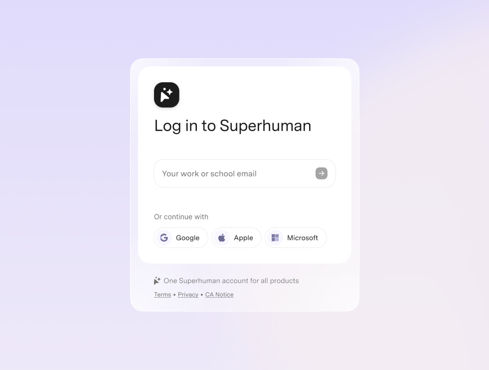
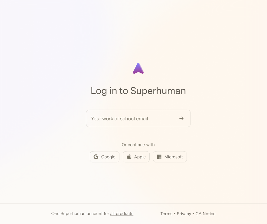
The only brand signal I had when I started was "it'll be purple." So the first visual direction came from the product itself, multi-turn interactions, chip-style controls, nothing stacked. Not standard sign-in UI. More like how Superhuman naturally behaves. I imagined those chip patterns eventually contributing back to the design system.
I built a clickable prototype with developer controls, test accounts, and milestone staging across four brand contexts: Genesis (the internal codename), Grammarly, Coda, and Superhuman Mail. Any email from any existing user database routed correctly. The prototype helped get engineering aligned.
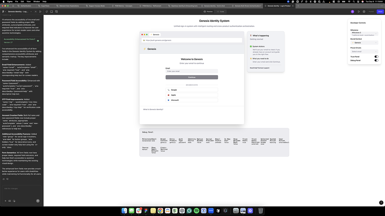
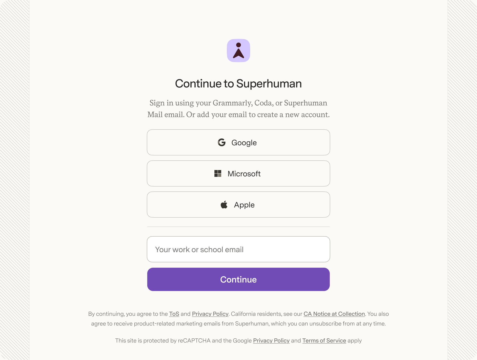
As the brand got closer, the constraint became clear: don't disrupt the Grammarly funnel. We pulled back from the pure identifier-first model, separate sign-in and sign-up flows, brought closer together. I worked with Orr, who was connecting auth into the full Superhuman.com experience, to consolidate every exploration into a single shared view. That work became the foundation for the CUJ (Critical User Journeys) playbook, a framework I built to map sign-up and sign-in quality across all products and brands. The org adopted it for measuring experience quality across the platform.
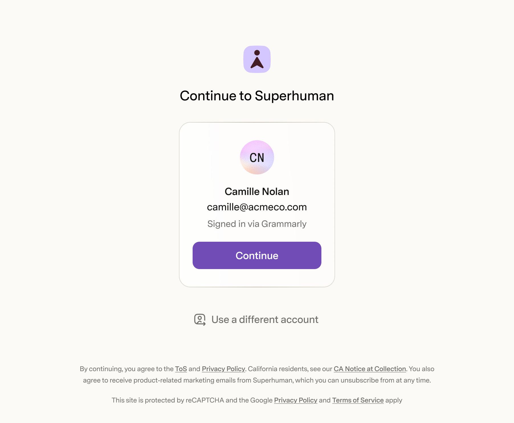
The last piece was active session transfer. Old model: enter a Grammarly email, get sent to Grammarly to auth, come back to Superhuman. New model: if you're already signed into Grammarly in another tab, the Superhuman front door recognizes you. Shows your name, your email, "Signed in via Grammarly." One click. Returning session, auto-redirect, no UI at all.
Outcomes
Launched October 2025. 91% auth completion rate at id.superhuman.com, with most users being fresh visitors to a brand-new brand. Engineering source of truth from first sketch through launch, every state mapped, every error path defined.
Background
Grammarly had a design system, it just lived entirely in code. The Lemma Design System was a robust set of tokens and components deeply integrated into SDUI, Grammarly's server-driven UI platform that delivered a consistent experience across browser extensions and its emerging desktop surfaces. It worked. But as Grammarly expanded to new platforms, the design decisions were entangled in SDUI in ways that made change expensive. The design org was small when we started, closer to ten people, but growing fast, and there was no Figma library, no documentation, no shared way to access or reason about what was already built.
Mark and I were brought in by Florian, the sole designer on the systems team at the time, to help scale it. We wanted to redesign things. Florian wanted to redesign things. But the risk of breaking changes in a system this tightly coupled was real. So we made a different call: put the creative ambitions aside and build the infrastructure around what already worked. Figma components that mapped to what was in code. Token naming conventions. Documentation. A way for designers and engineers to access the system without depending on the systems team for every decision. The system was already load-bearing, tightly coupled to SDUI, and breaking changes carried real risk. We chose infrastructure over redesign.
Foundations
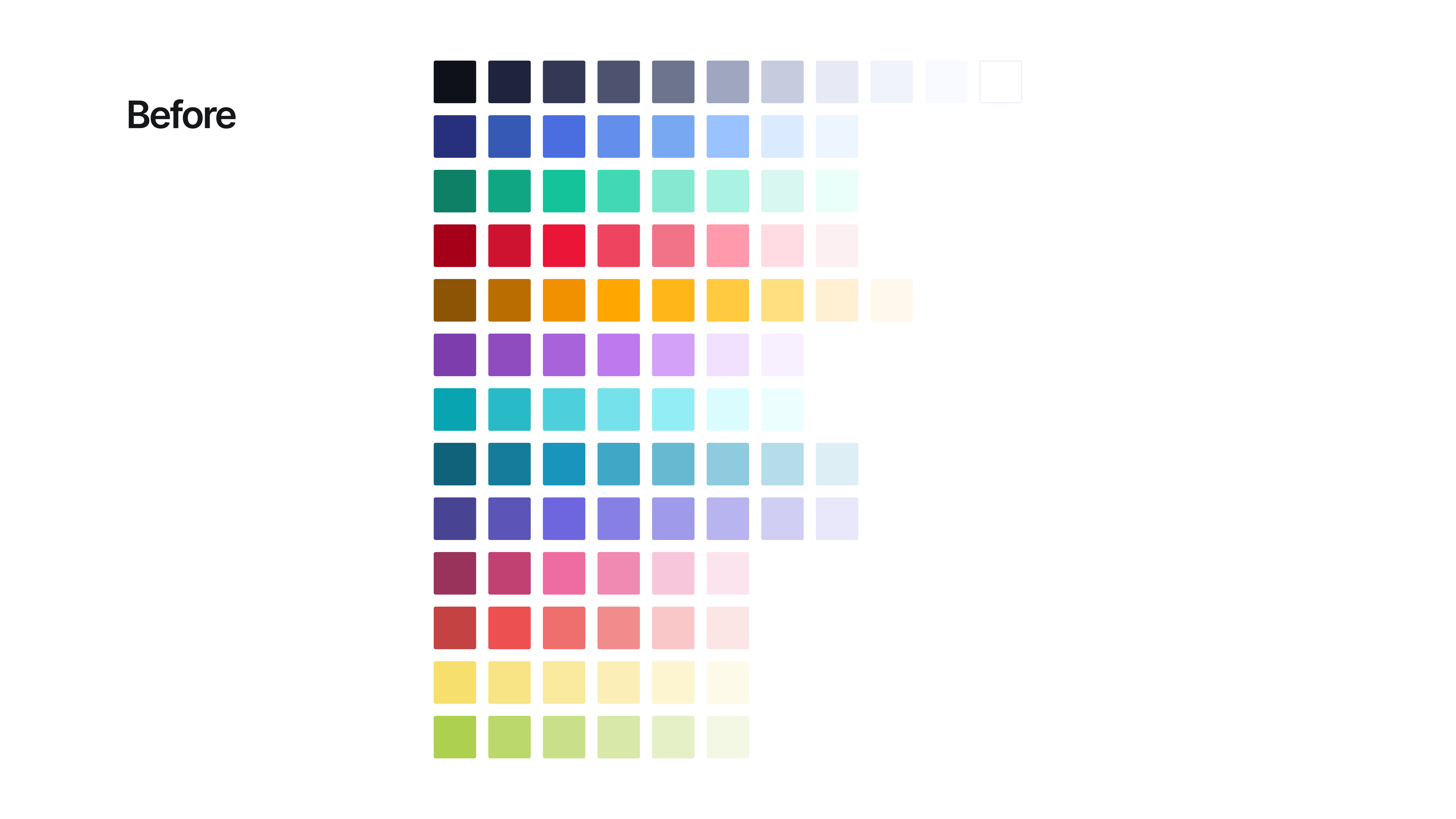
The approach was to build on what already had traction, not replace it. Foundations first. The color palette was consolidated, and before, every product had accumulated its own sprawl of shades with no naming convention or hierarchy.
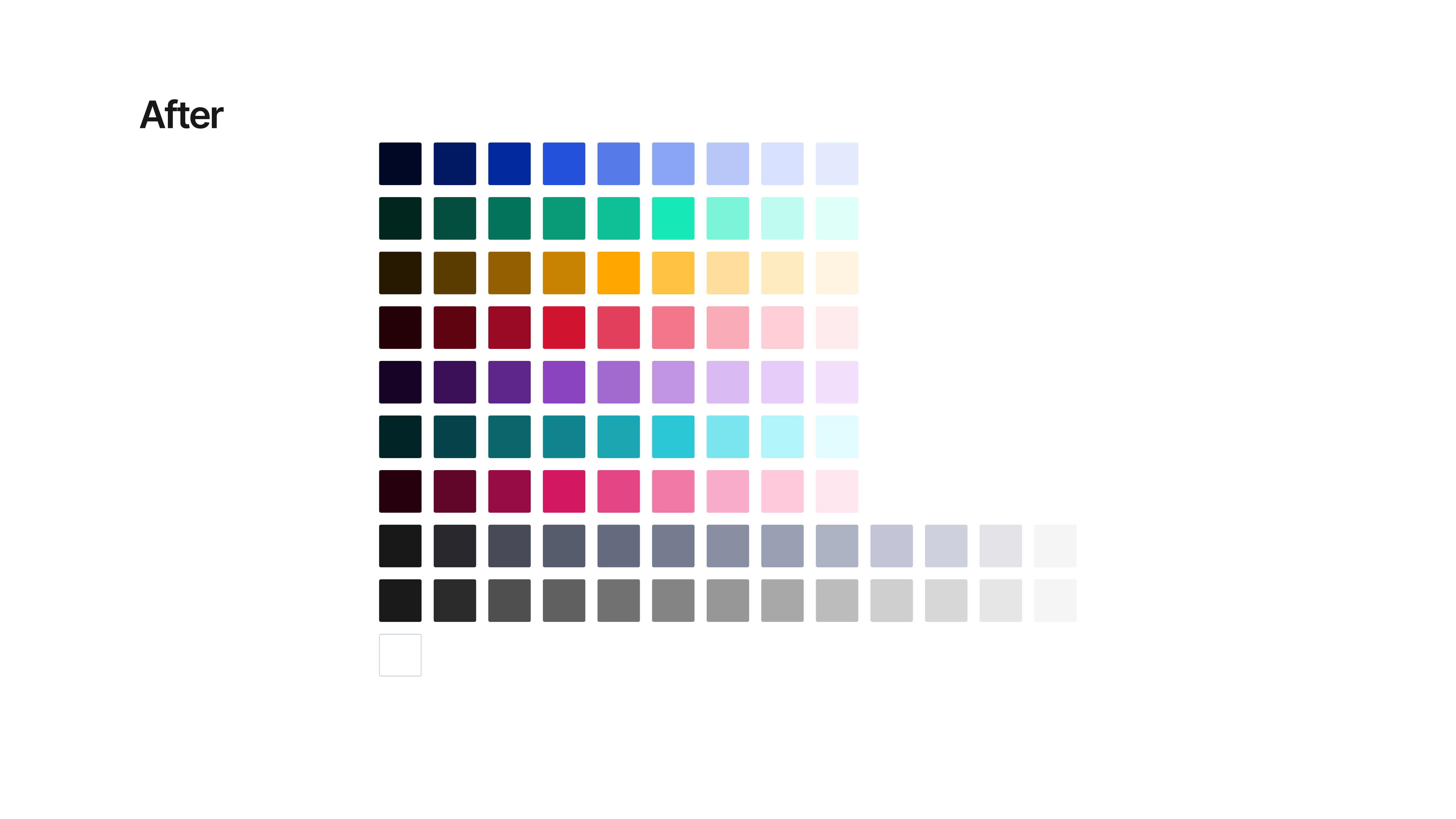
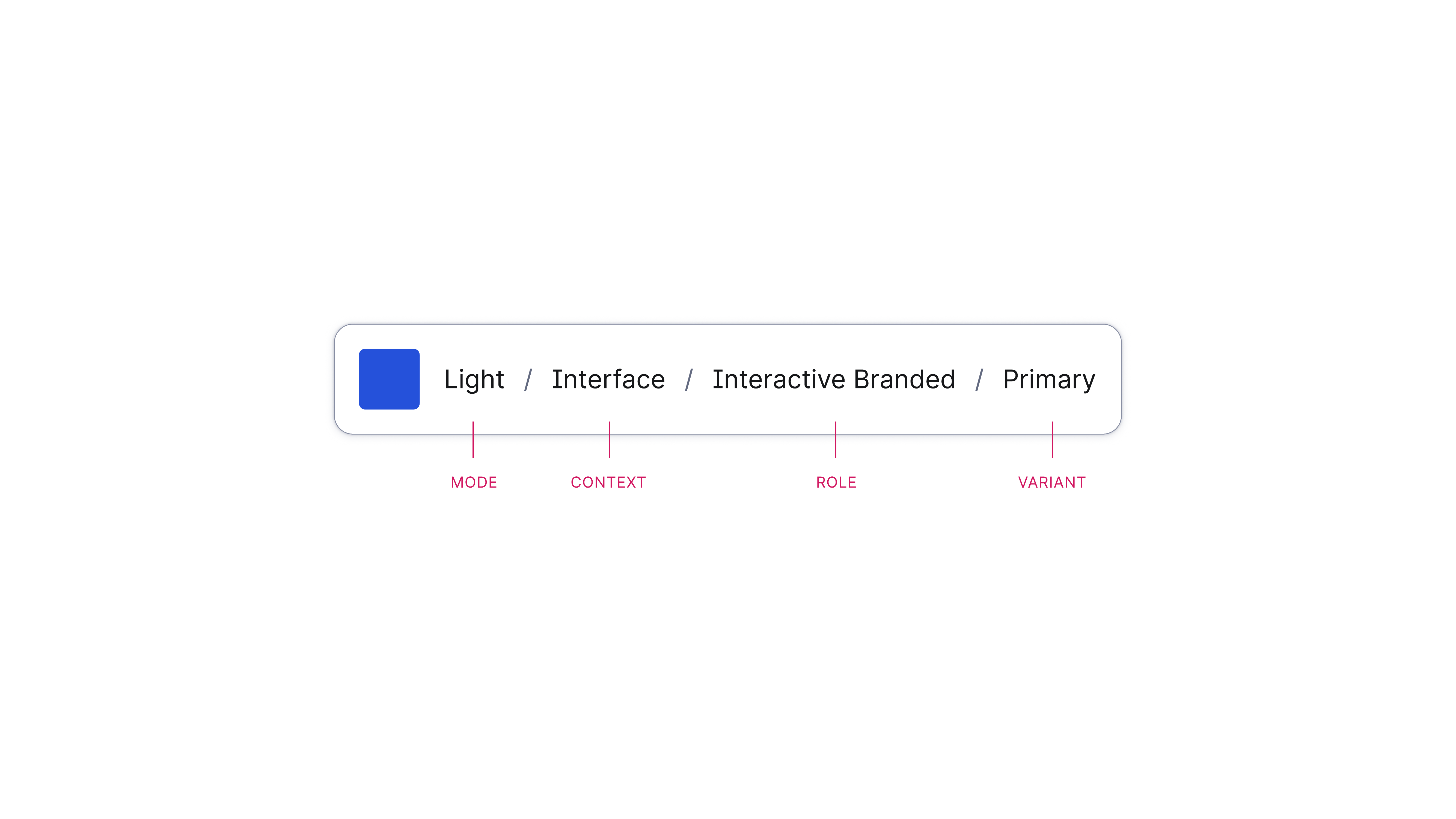
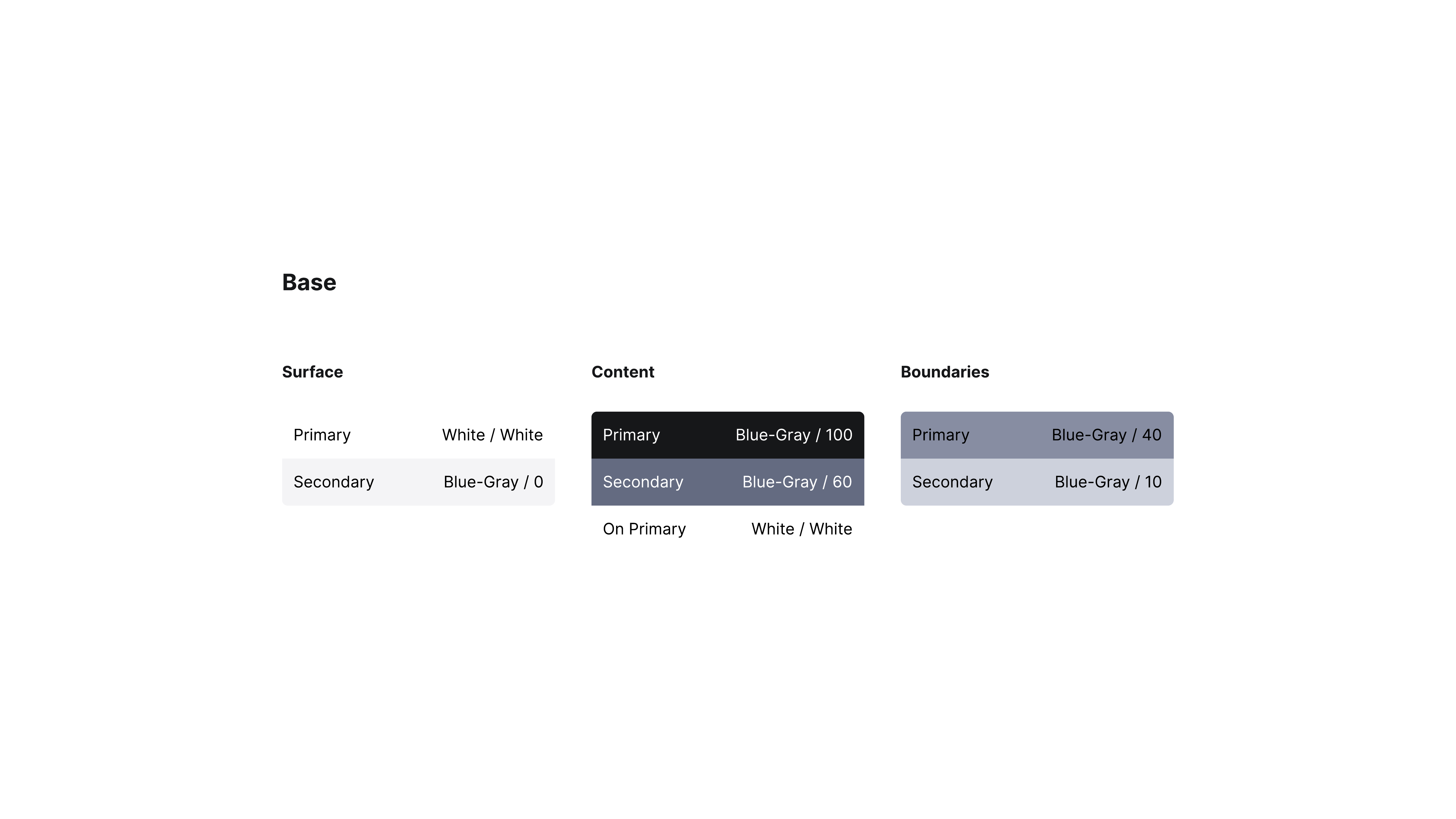
Above the core palette: a semantic layer. Colors named by role, not value, Surface, Content, and Boundaries, each mapped to a four-part token convention: Mode / Context / Role / Variant. Future-proofed for rebrands by design.
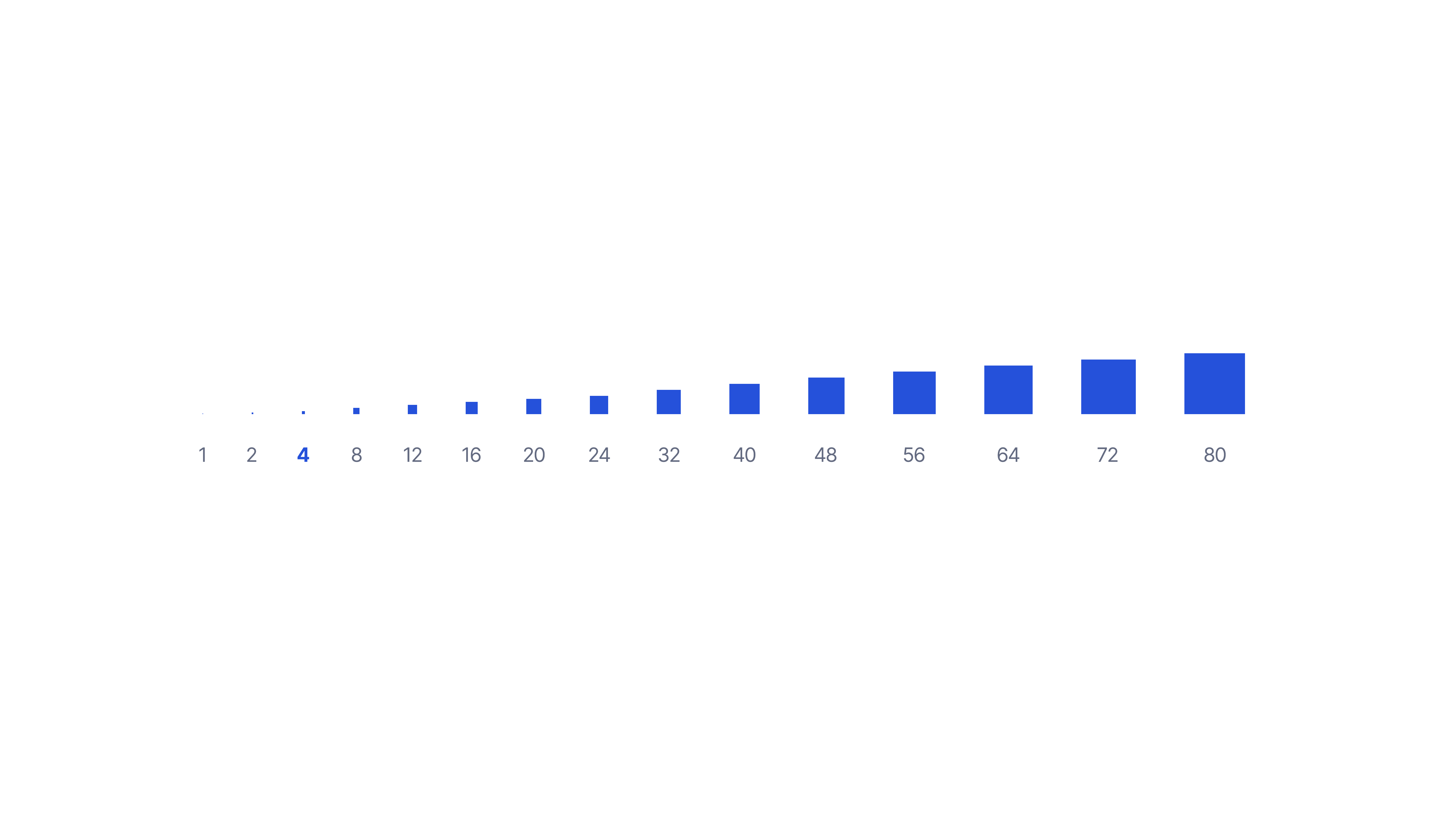
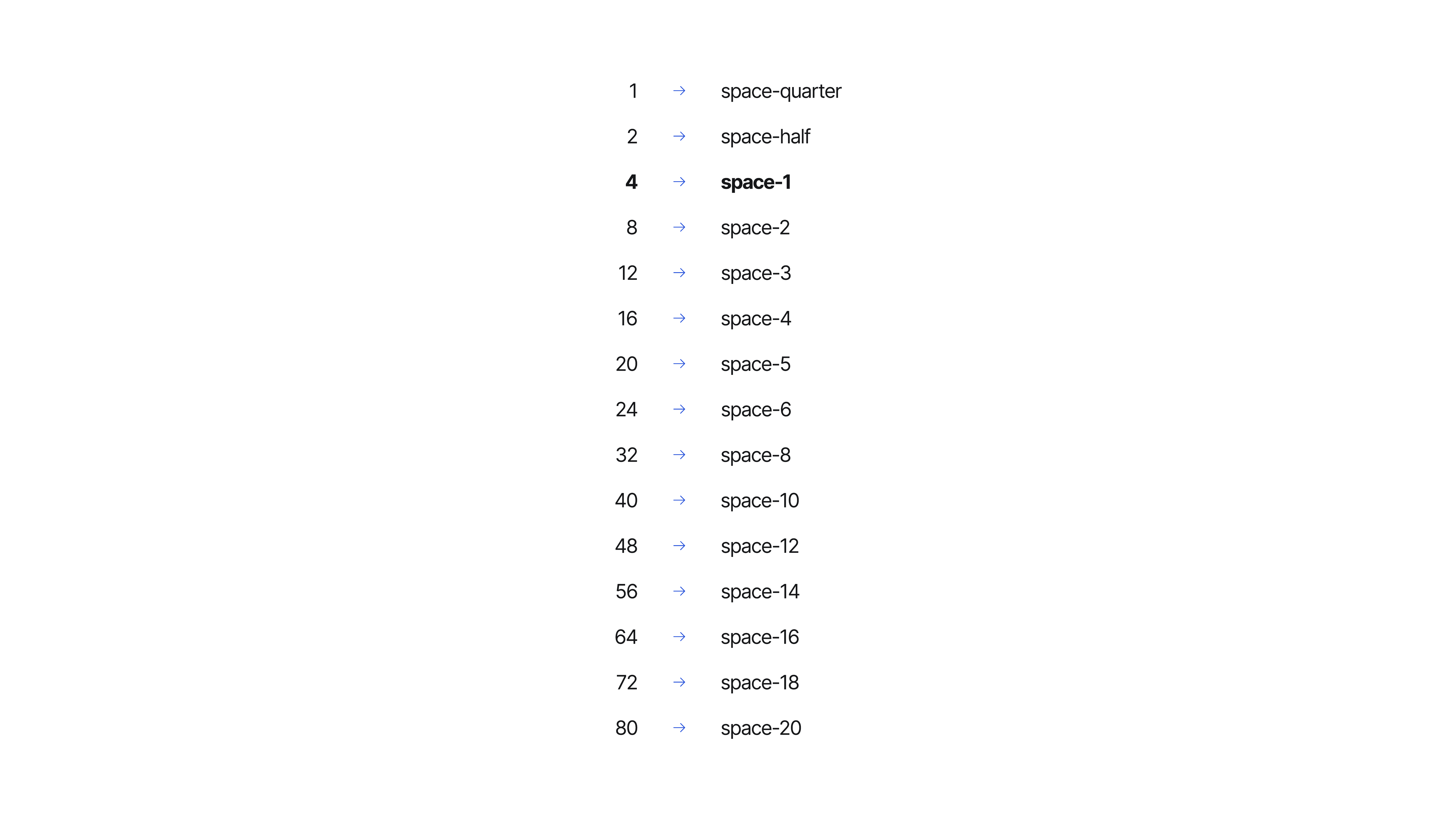
Spacing and radius scales followed the same logic, named tokens, consistent steps, documented usage rules.
Components
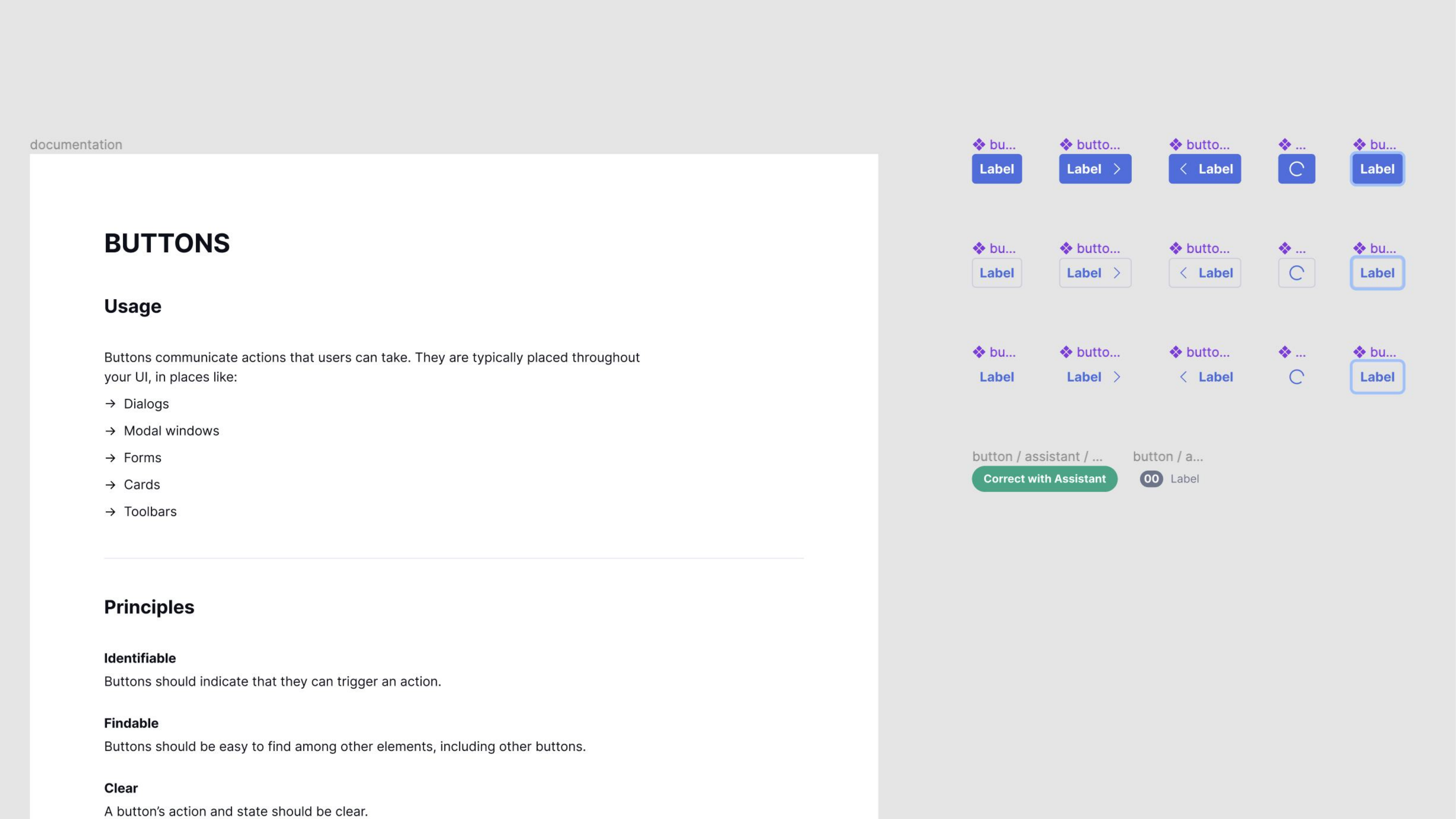
The Figma component library was restructured from the ground up, layer trees flattened, everything renamed for findability. Before: components buried under category group names that matched no one's mental model. After: flat, alphabetical, searchable.

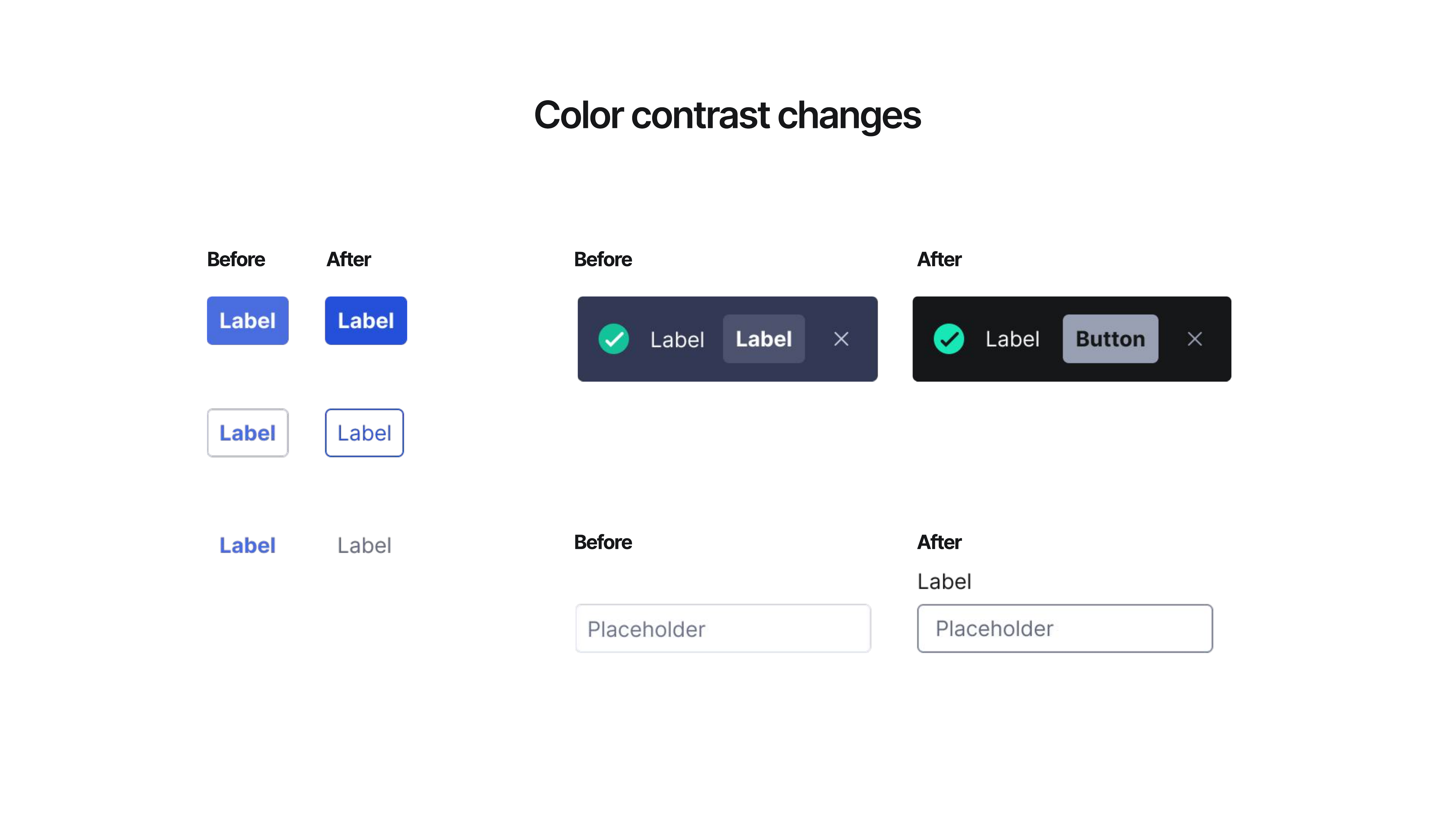
Accessibility was baked in. Color contrast was updated across the component set, buttons, banners, and form controls, and documented so engineering could implement with confidence.
Variant matrices mapped 1:1 to what was in code. The docs site had standardized templates so contributors could add pages without involving the systems team.
Community + adoption
Governance mattered as much as the components. Formal contribution process, review criteria, and design standards. Friends of GDS embedded champions across product teams, designers who could answer questions locally and reduce dependence on the systems team for every decision.
Outcomes
Adopted across the org. Fragmentation reduced. The system survived the Superhuman acquisition and a full brand overhaul, and the token names held.
Card systematization
After shipping GDS v1, the next expansion was suggestion cards, Grammarly's most complex and most-seen component, grown independently across surfaces with no shared model. The work started with a knowledge-share session: which clients use which cards, what the differences were, and what the SDUI-to-SCA architecture transition meant for the component going forward.
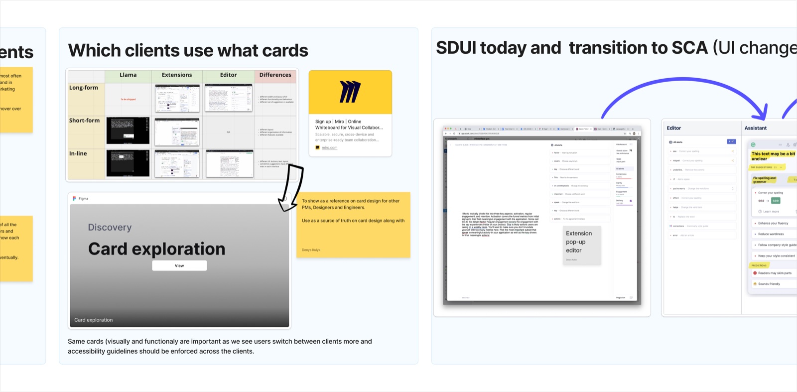
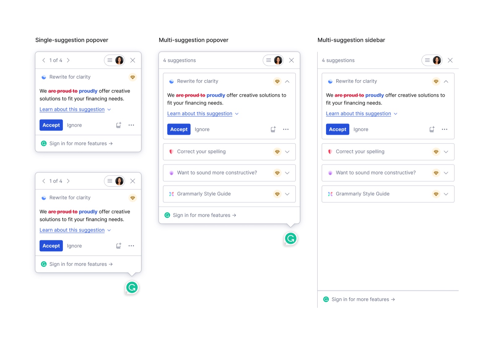
From there, an inventory: every existing card state documented across surfaces, extension popover, desktop popover (two trigger modes), multi-suggestion variant, native editor sidebar, and Google Docs sidebar. The same suggestion data, rendered differently depending on where you were.
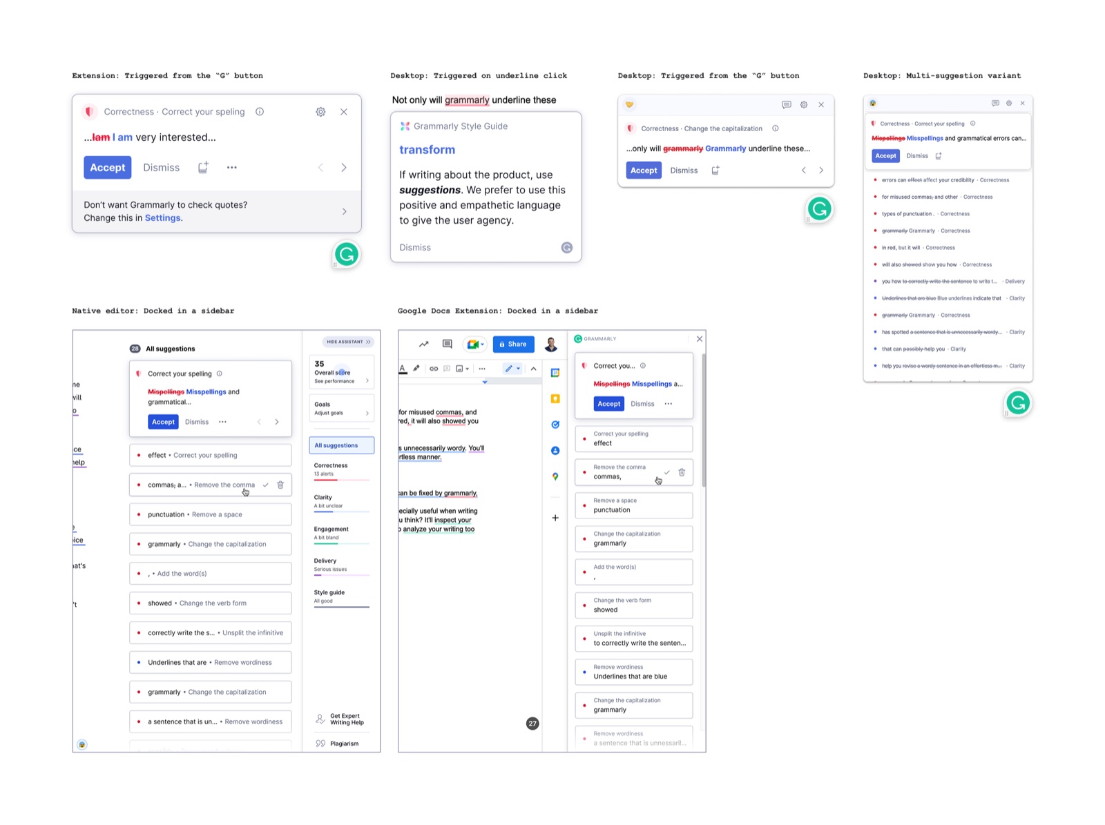
With the inventory done, we modeled the structural architecture. Four container types, contextual single-suggestion popover, fixed single-suggestion popover, multi-suggestion popover, and multi-suggestion sidebar, each broken into layered sub-components: Nav Bar, Card (Header, Content, Action Bar), Footer. Visualized as both a flat diagram and an exploded layer stack.
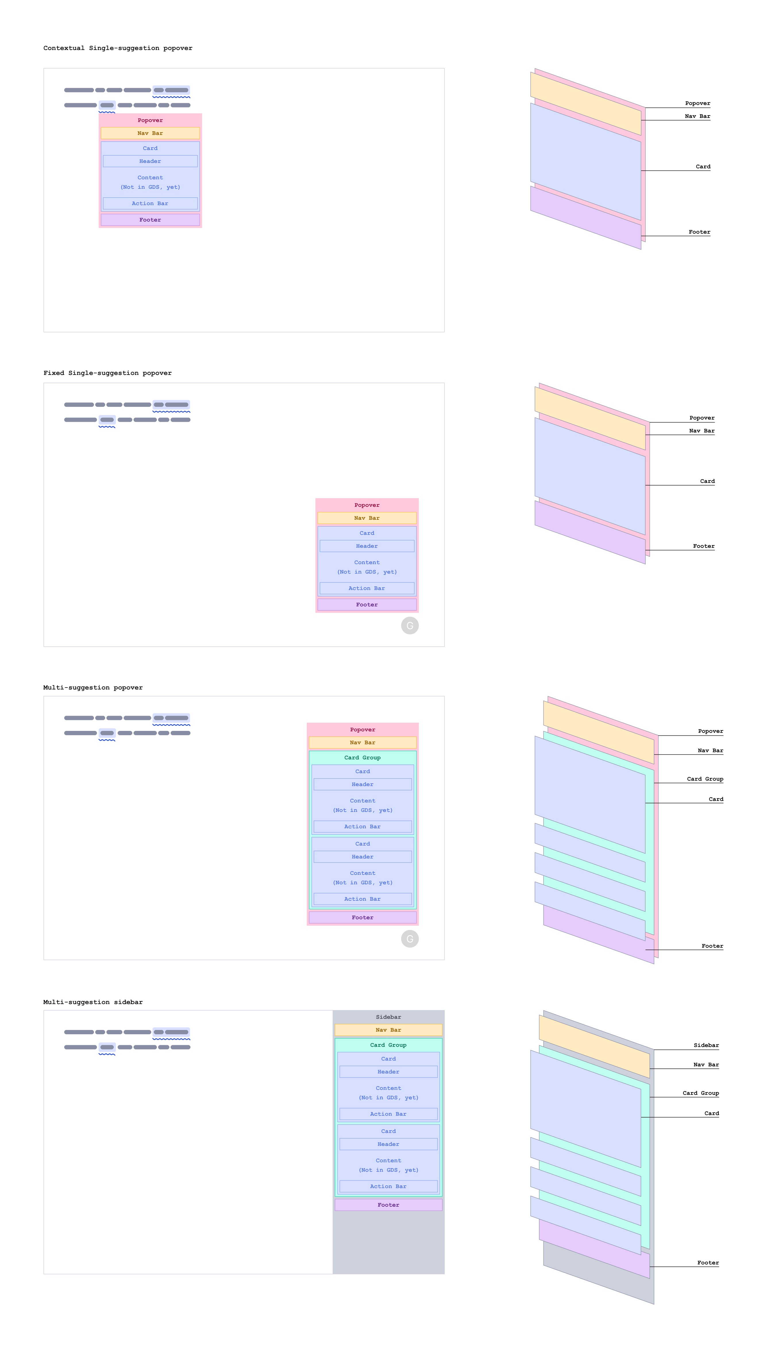
The proposed direction: one unified design for all four delivery types, using the same component model and sub-component structure adapted to each context.
The goal was to set a clear direction and break each delivery surface down into its generic sub-components, Nav Bar, Card, Action Bar, Header, and Footer, so they could be documented into GDS and reused across the product. I left the team with the plan and the schematics and went on paternity leave. When I came back, I moved into a product design role on the Trust team, a lateral move to fill a business need, and stayed close to GDS as a contributor, eventually being featured in the Token Times for contributing the Verification Code component.
The problem
As Grammarly moved upmarket and started shipping generative AI features fast, privacy went from being a legal checkbox to being a real product problem. Consent flows were inconsistent across teams. Settings were scattered and buried. Enterprise customers needed data sovereignty. And every new AI feature meant explaining to users what was being collected and why, in a way they'd actually trust.
The question wasn't how to add consent UI. It was how to make privacy a platform that the whole org could build on.
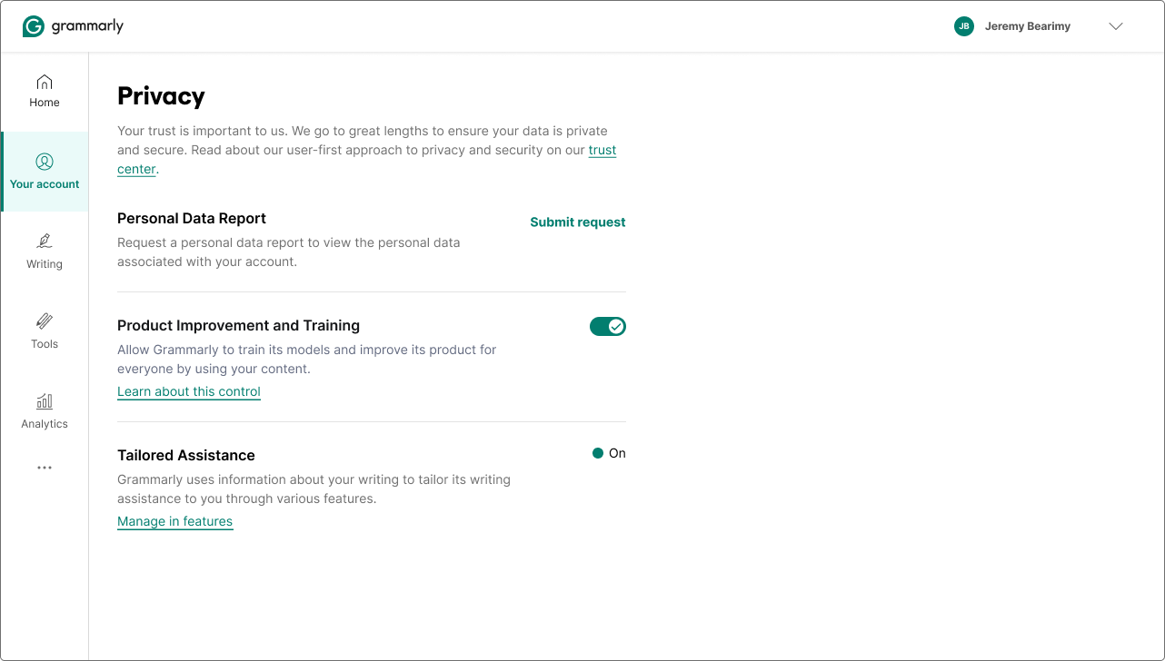
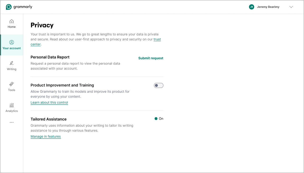
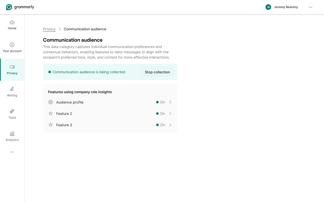
CDTC, AI Training Control
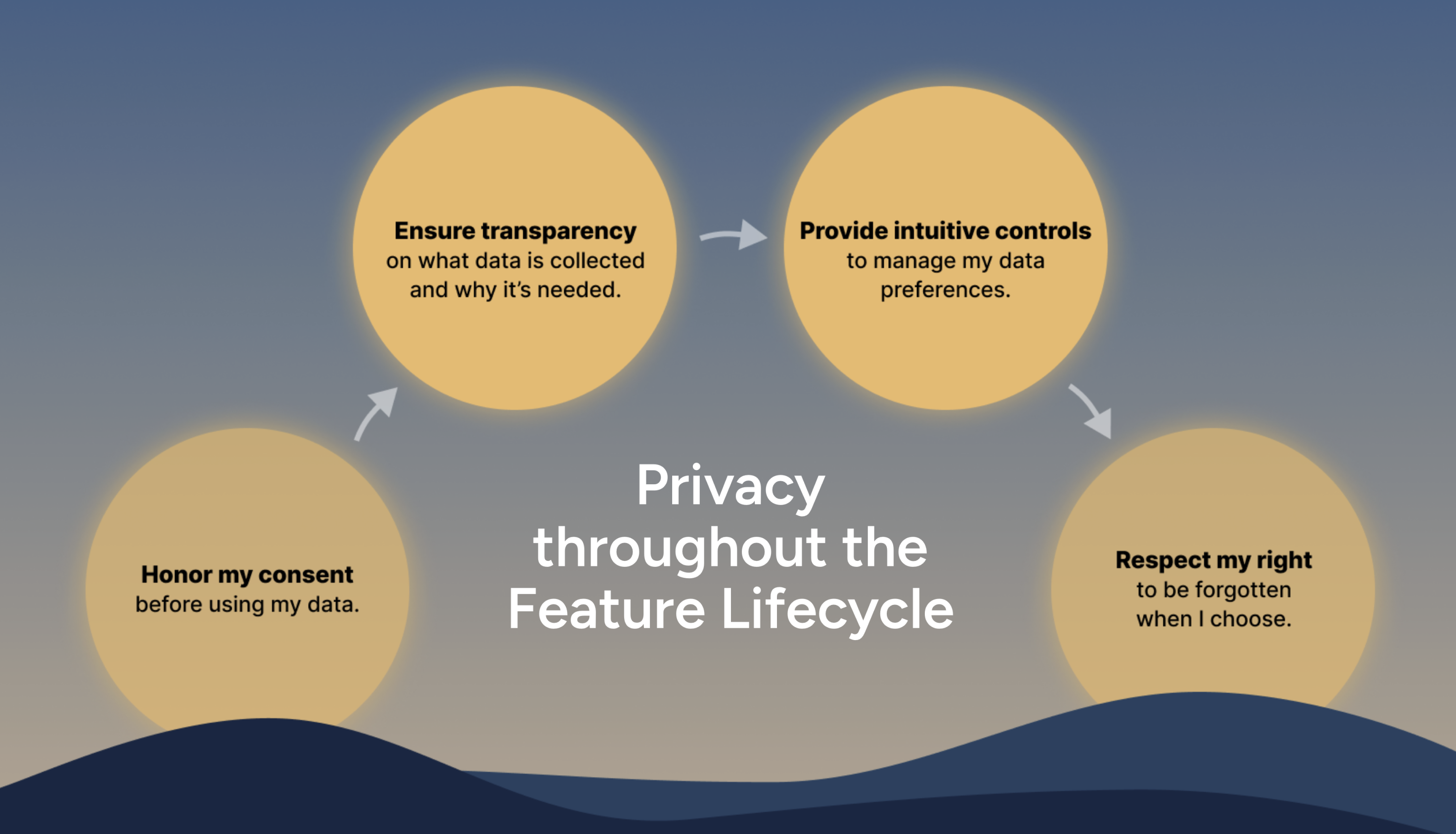
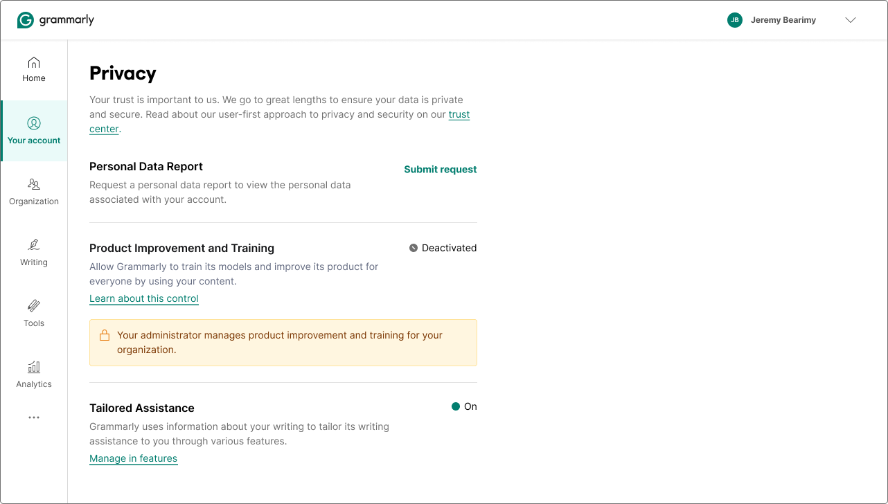
People hear "AI training toggle" and picture a switch. This one took weeks to design, not the UI, the logic. Before a single pixel moved, I was in rooms with the PM, the privacy engineer, and the backend engineer working out the decision matrix: who sees a control at all, when is it editable, what does "locked" mean for a managed user versus an EU user, and what happens when someone moves between account types and their previous state needs to be restored.
The most important design decision wasn't a UI decision. It was a product stance: we will not train on EU or UK user data. No toggle. No opt-in. GDPR meant the answer was baked in, and the right interface for that wasn't a switch, it was an explanation. EU users see a message where the control would be, not a control they can't use.
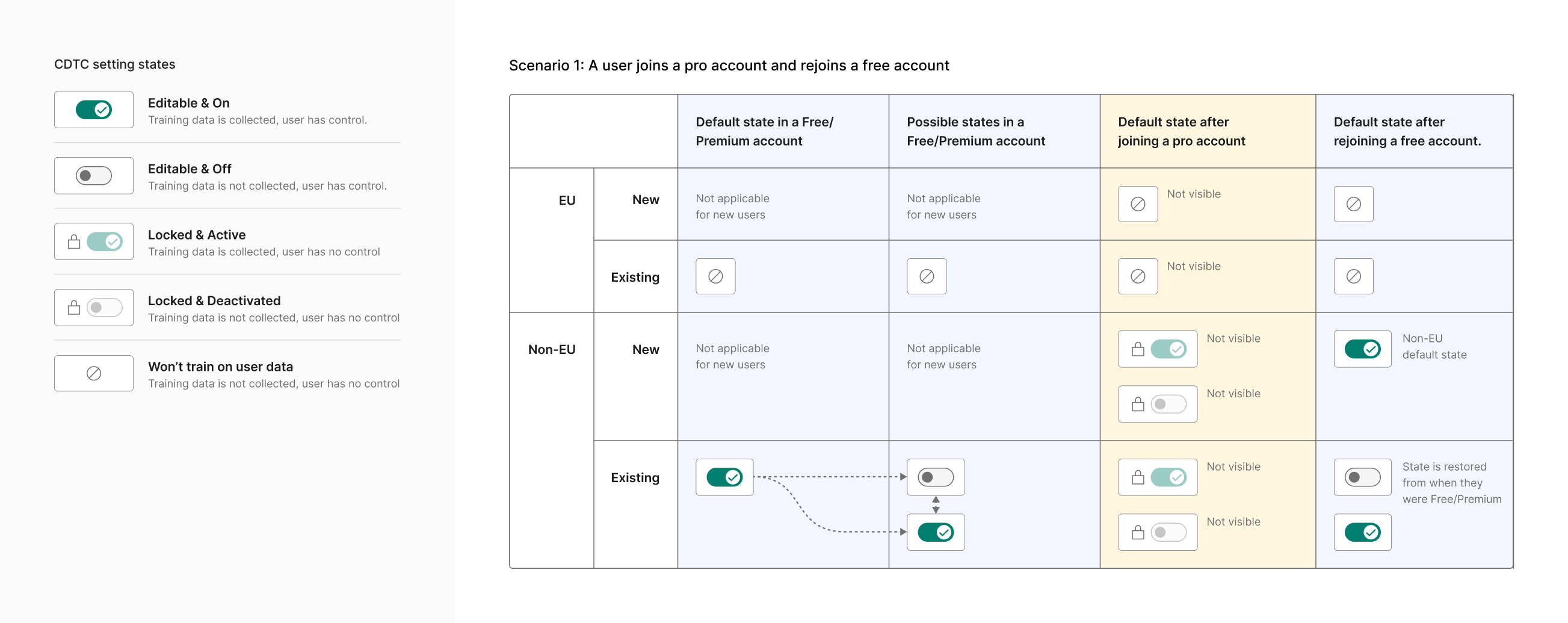
The managed client case was the other hard one. Enterprise admins set the training policy for their org, and their users have no control. But there are two locked states: locked and active (admin enabled training) and locked and deactivated (admin disabled it). Each communicates both the current status and the reason. A user shouldn't see a disabled switch and wonder if something is broken. They should know their org made the call.

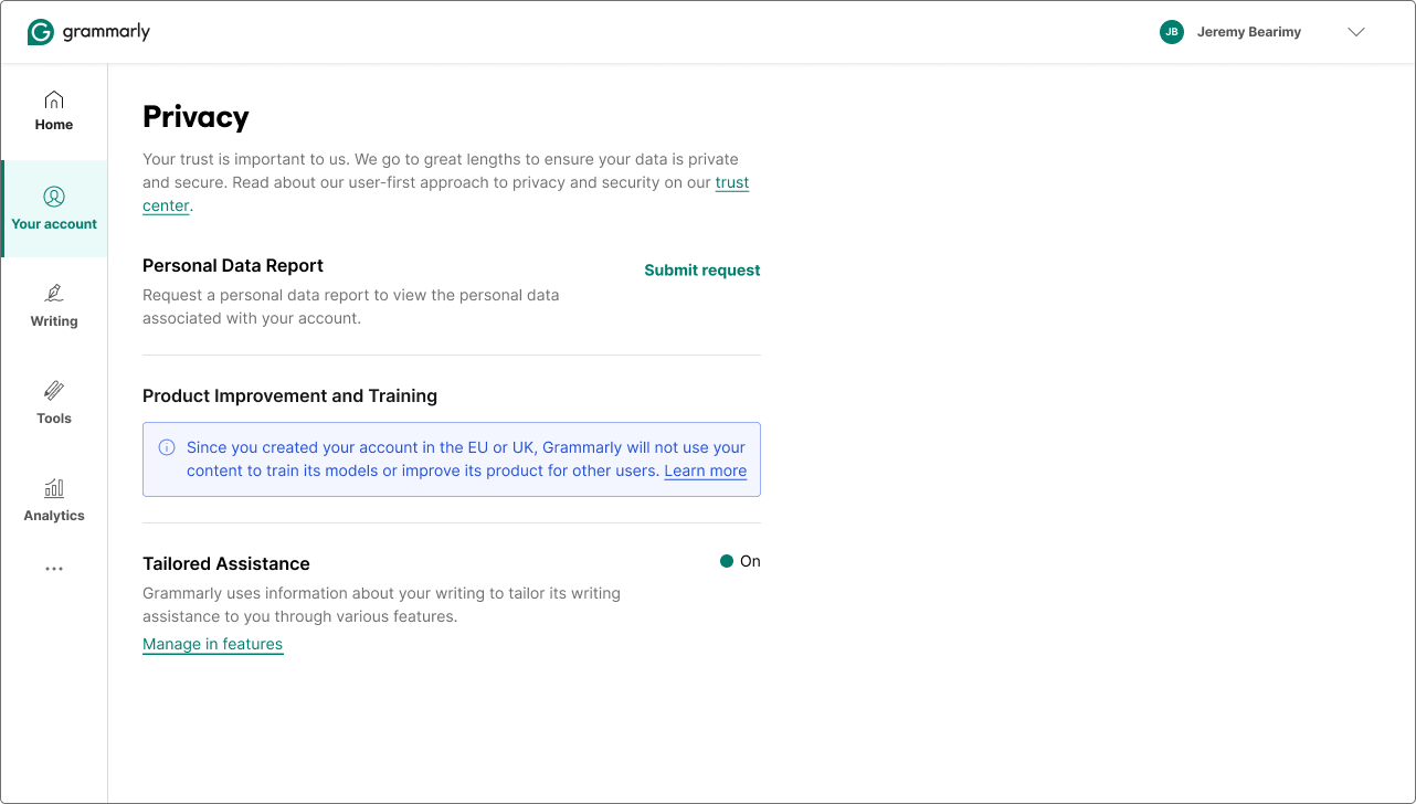
Five states total. Each one communicating status, reason, and the right level of agency for that user's context. Launched June 20, 2024, the same day Grammarly emailed 70 million users about the privacy policy update.
CMP
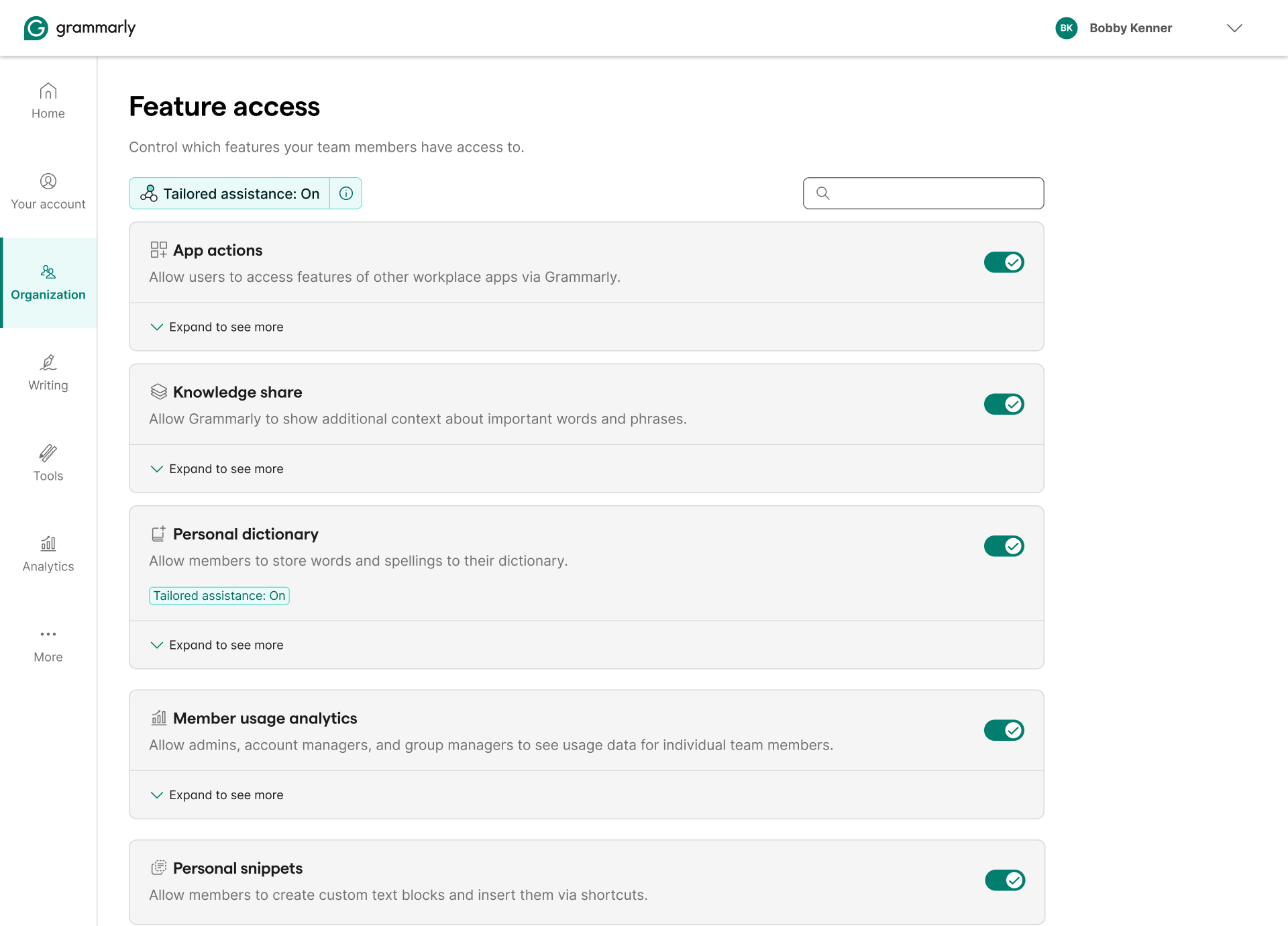
A plug-in framework for product teams. Give us a feature name, a data list, and a usage explanation. We render the consent modal, the opt-out flow, the in-product invitation, and the admin controls, with the same trust pillars and data language every time. It survived a major pivot (tone personalization → AI training controls) and extended from individual users all the way to org admins.
The content strategy behind the modal was its own design problem.
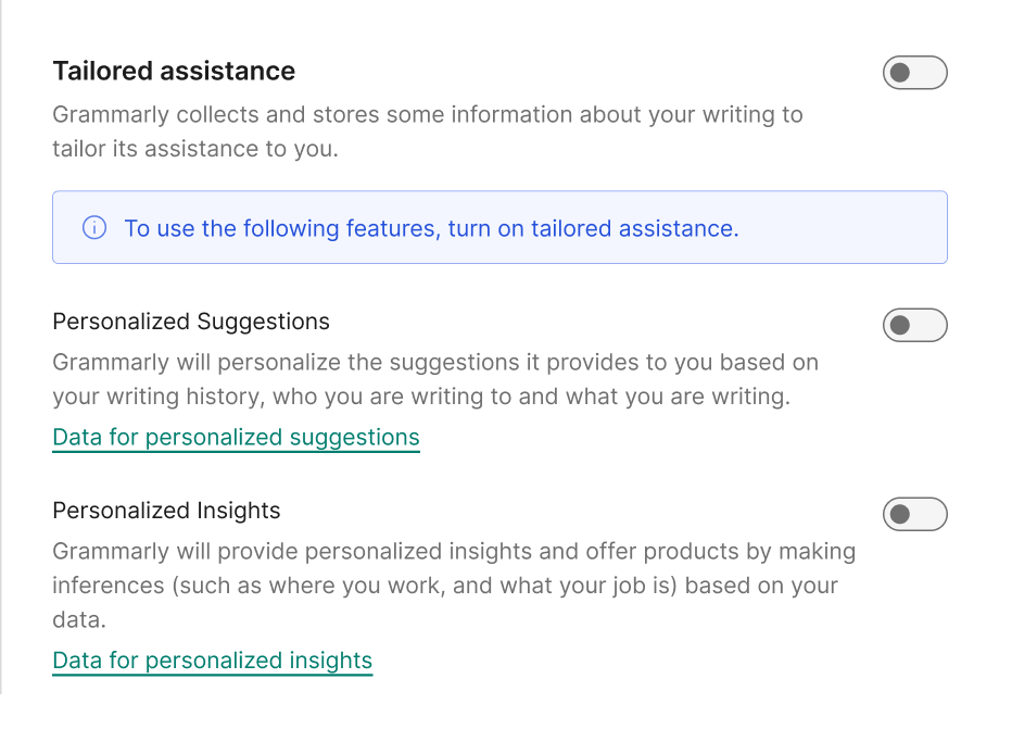
The word "tailored"
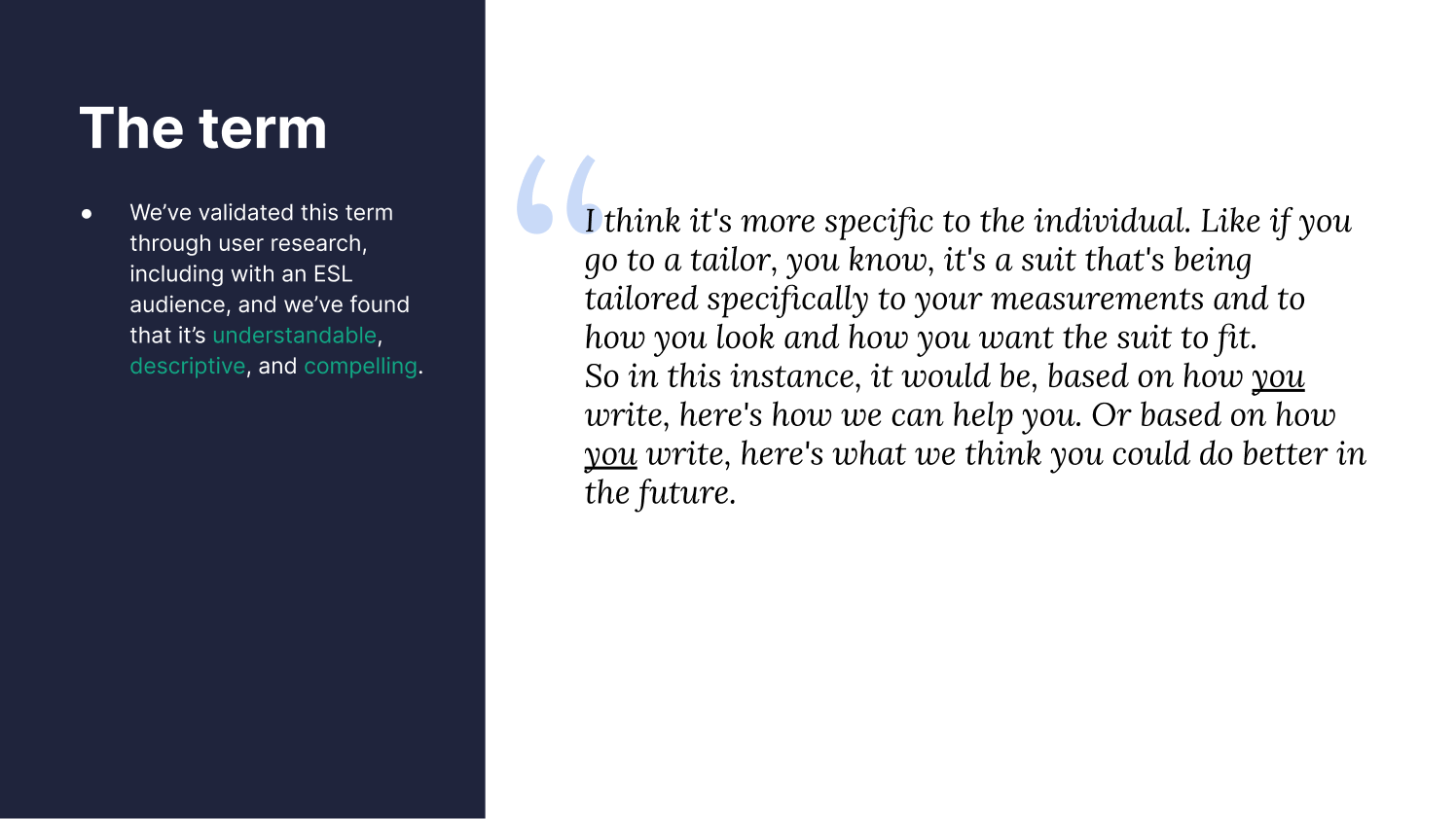
Not picked by accident. Before settling on a term, I audited how 17 competitors named their data consent features. Most default to "personalization," safe, familiar, but vague. We wanted something that was relational to the user and honest about what the feature actually does. "Tailored" landed in the right quadrant: candid about data, but framed around value, not compliance. Grammarly learns your specific writing style, not just aggregate preferences. The word earns that.
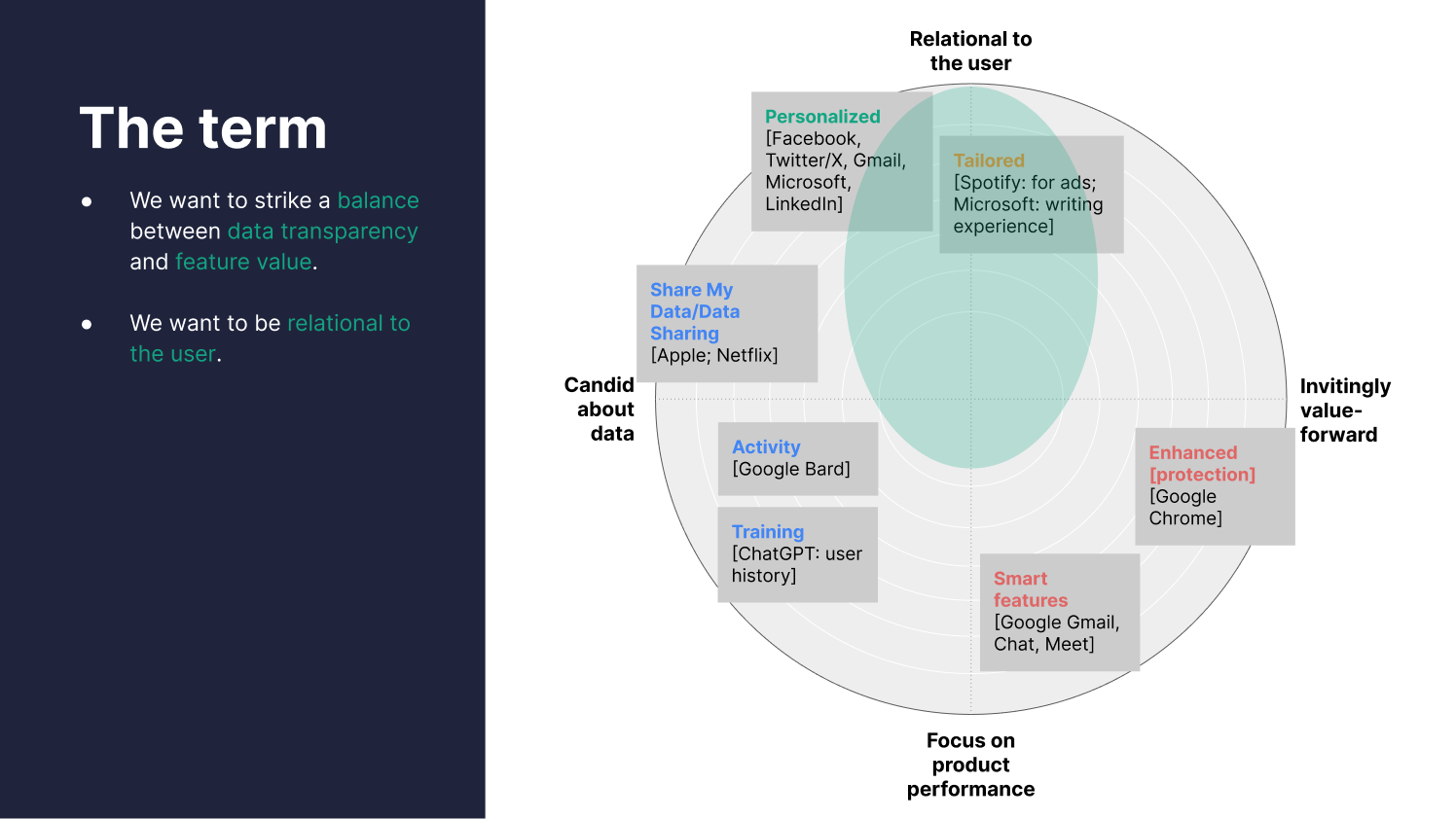
We validated "tailored" through user research, including with ESL audiences. It tested as understandable, descriptive, and compelling, and users intuitively connected it to something made specifically for them.
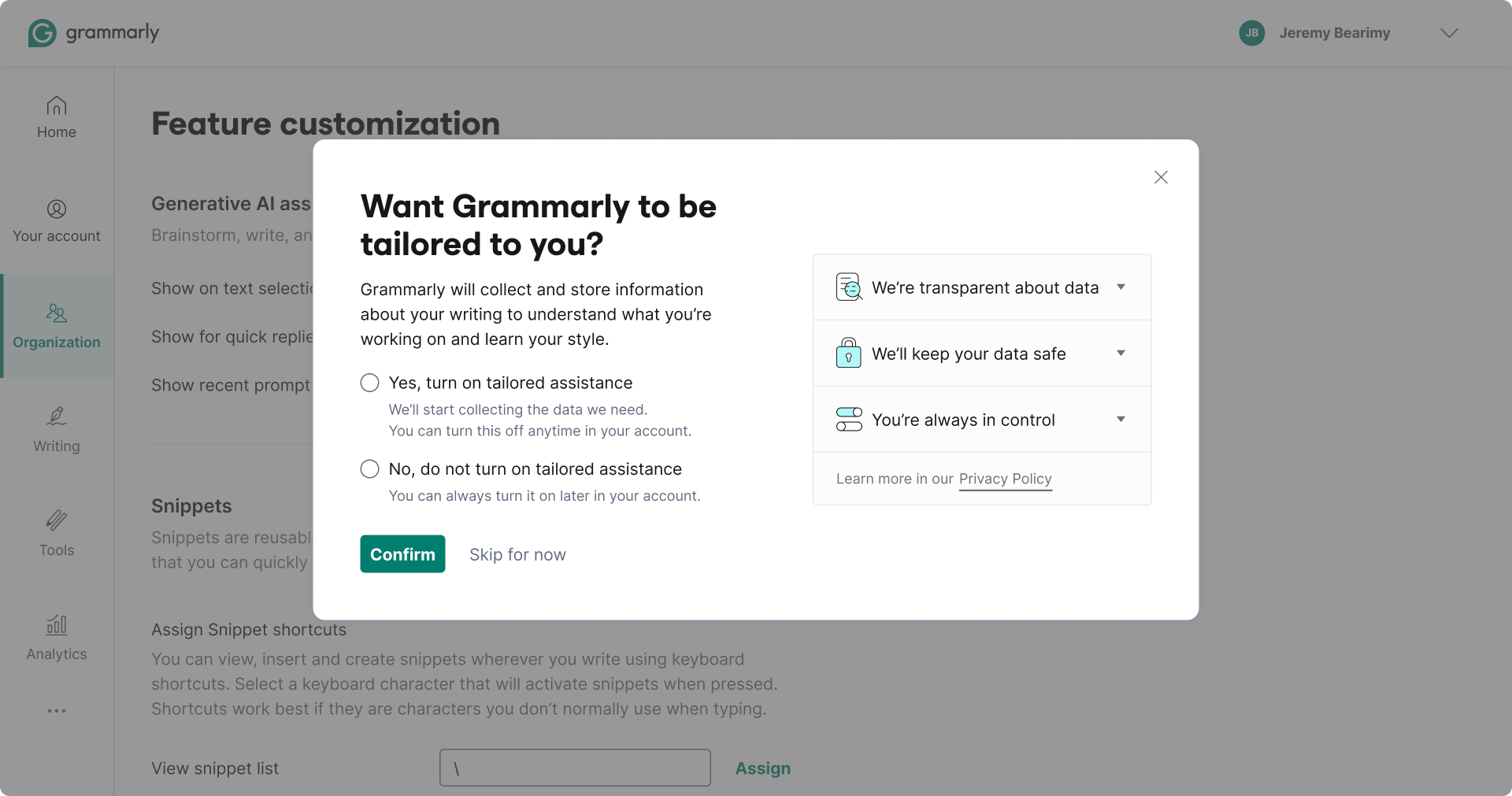
Every phrase chosen
The headline is a question: "Want Grammarly to be tailored to you?" Not a statement, not a pitch. Framing it as a question was deliberate, we didn't want to nudge users toward consent. We also rejected "tailored assistance" as the headline: too clinical, sounds like a feature name rather than a benefit. The Yes/No options sit directly below it, aligned, with no visual hierarchy pushing toward one answer.
The body text was word-by-word. "Grammarly will collect and store some information about your writing," transparent about what we take, nothing buried. "Understand what you're working on," plain language for context collection, no jargon like "natural language processing." "Learn your style," personalization framed as individual, not algorithmic.

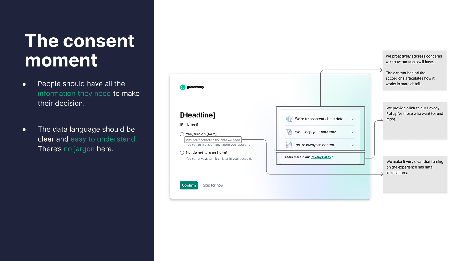
The consent moment
People make an experience-convenience tradeoff when they see a consent screen. We designed for that: lead with the feature benefit, make the data implications explicit, give people the detail they want without forcing it on them. The accordions carry the depth, and most users won't open them, but the act of making them available is part of the trust signal. No jargon anywhere. Tested extensively, including with ESL audiences.
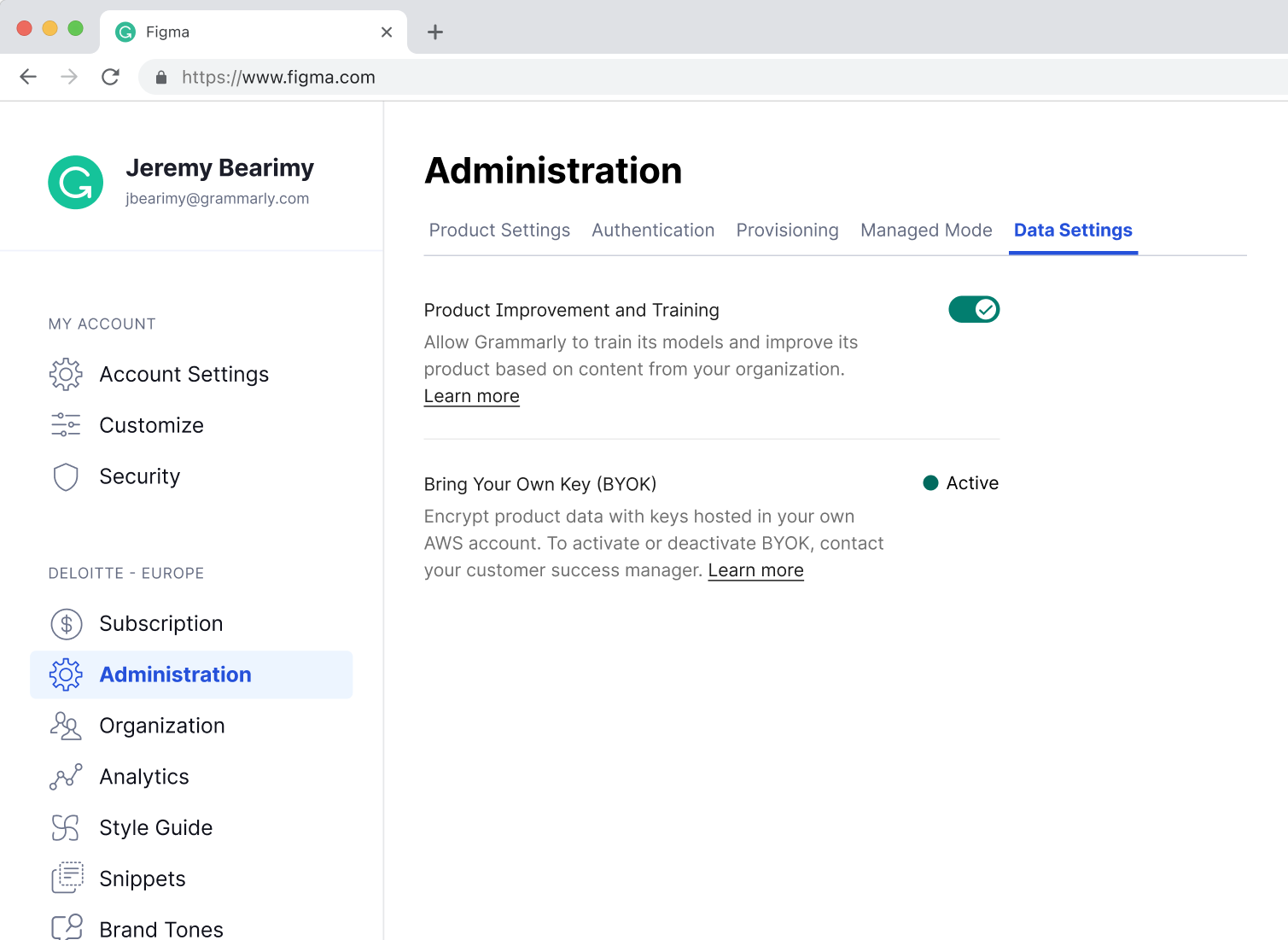
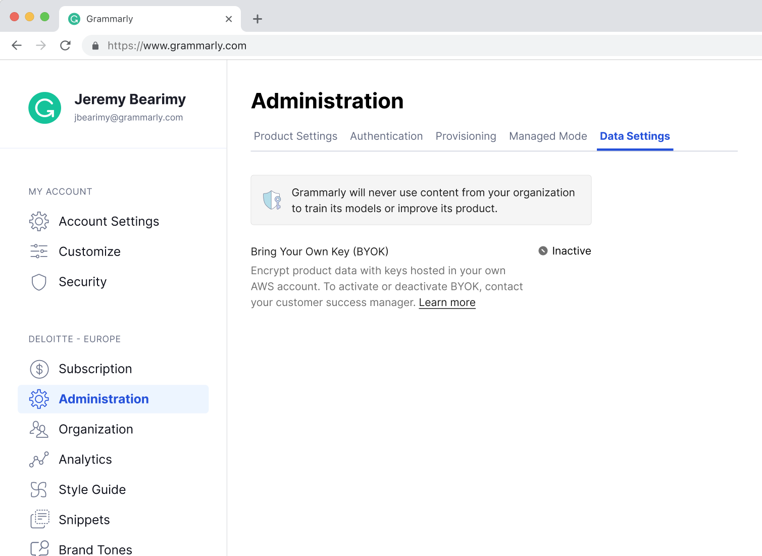
BYOK, three quarters, one arc
Bring Your Own Key lets enterprise customers encrypt their Grammarly data with keys they control in their own AWS account. Grammarly never touches the key. The design challenge wasn't the cryptography, it was making a feature built for security teams legible to the IT or legal buyer who evaluates it, without dumbing it down for the engineer who sets it up.
Q2, Read-only
The MVP shipped BYOK as a status display only. Active or Inactive. To change it, contact your customer success manager. No self-serve, no controls. That was intentional, BYOK needed to exist in the admin panel before it could influence procurement decisions. Enterprise IT teams evaluate features before they buy. If it doesn't show up, it doesn't count.
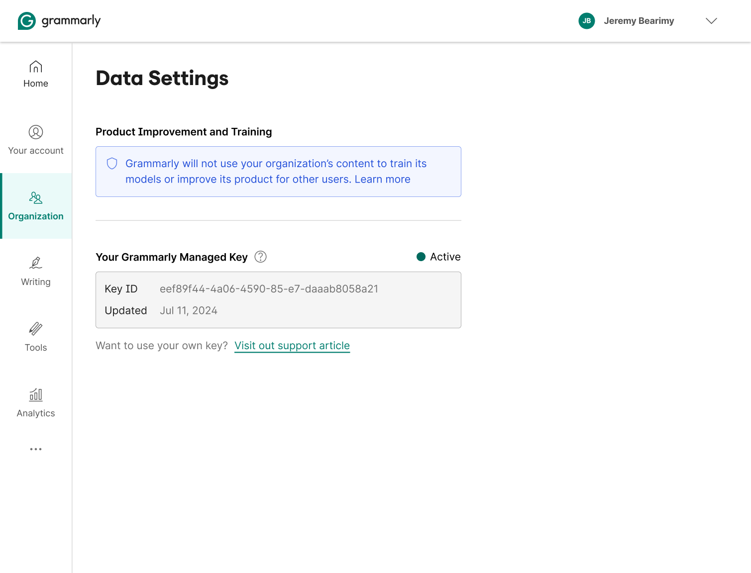
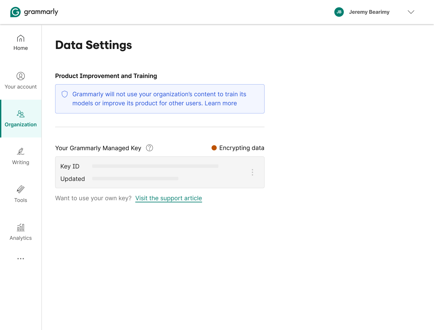
Q3, Make encryption legible
Before you can ask someone to replace their encryption key, you have to make the current one visible. Q3 introduced the Grammarly-managed key as a named entity, surfacing the key ID, the last-updated date, and a clear path to BYOK. Encryption went from invisible infrastructure to something admins could actually see and reason about.
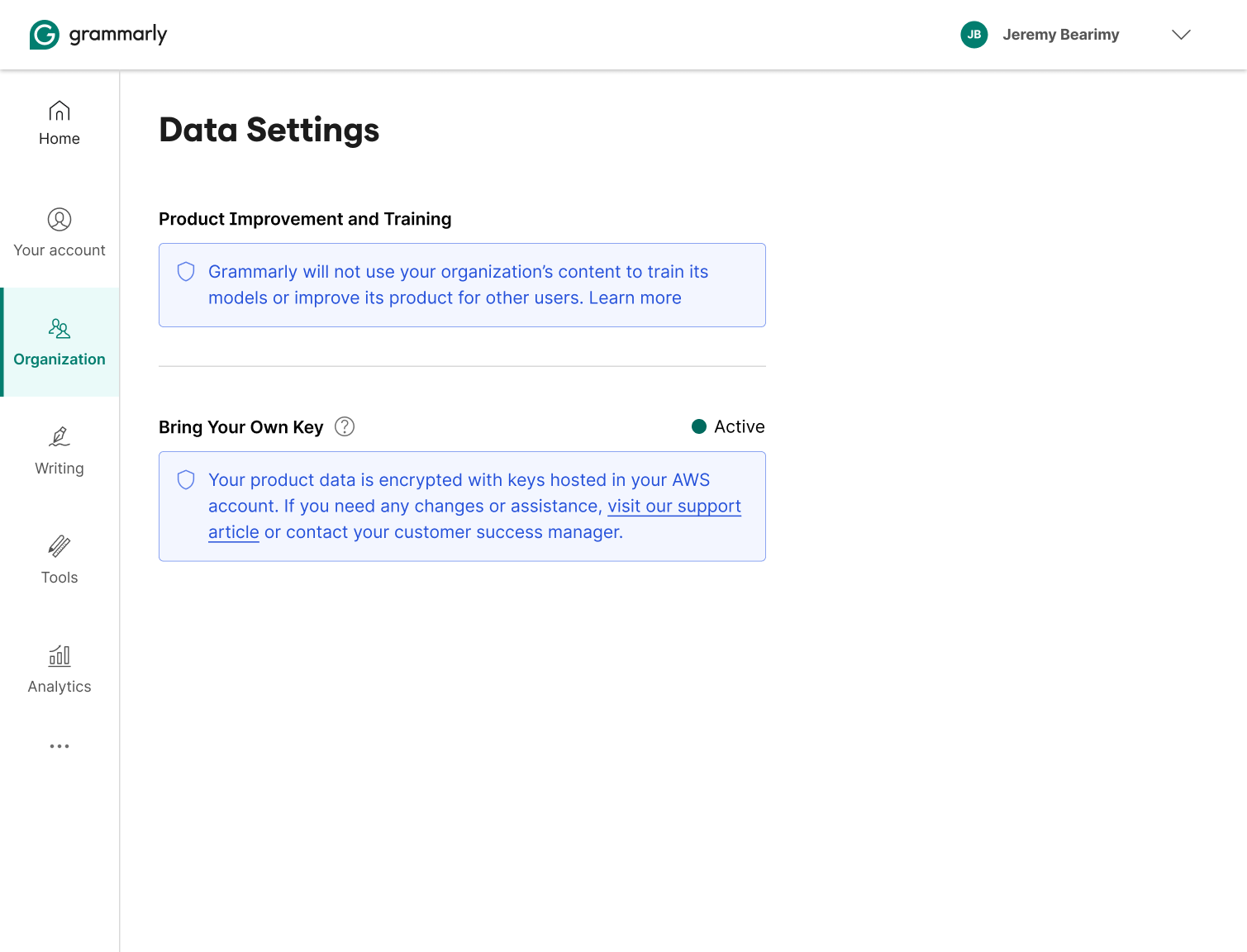
Q4, Self-serve
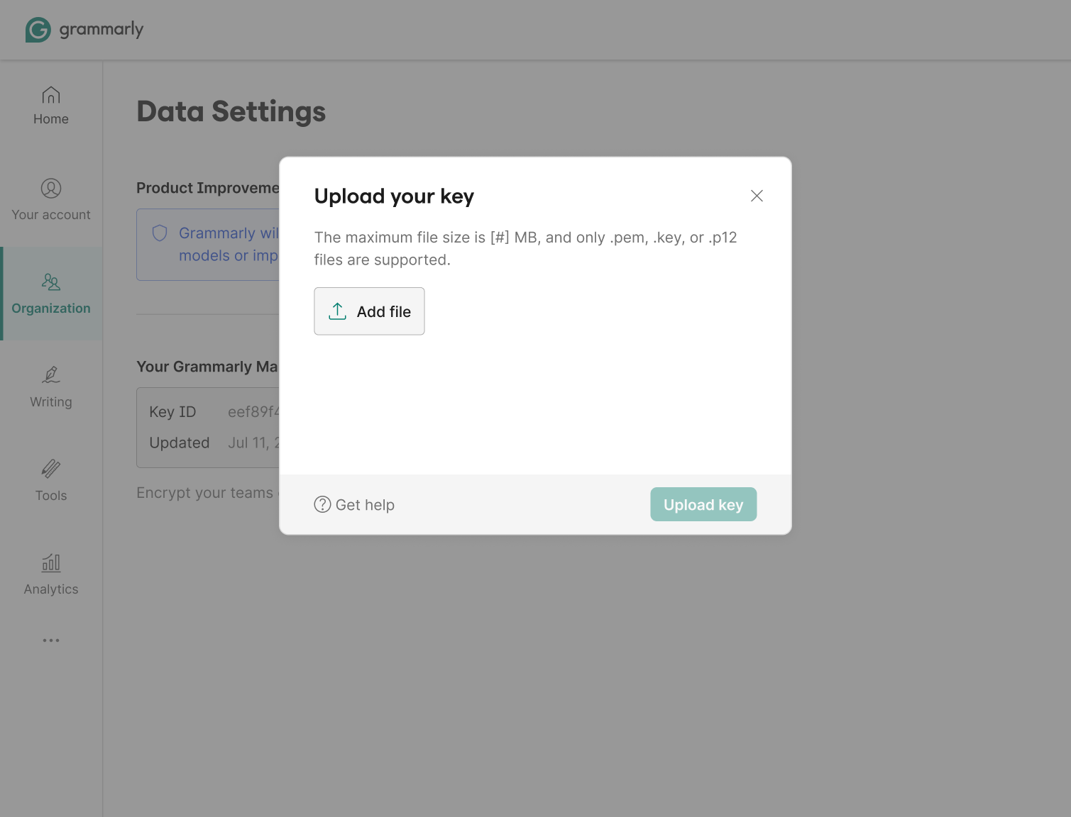
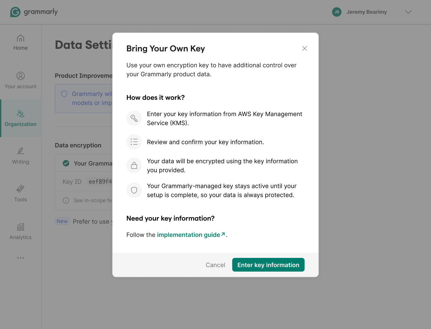
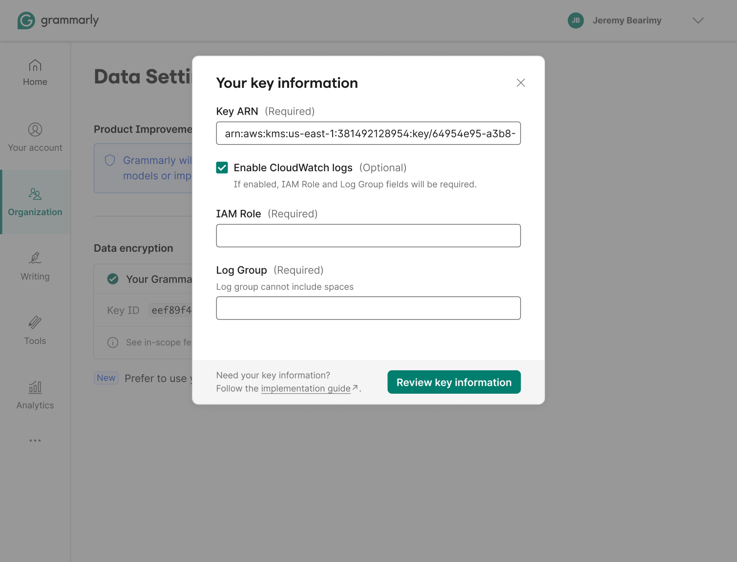
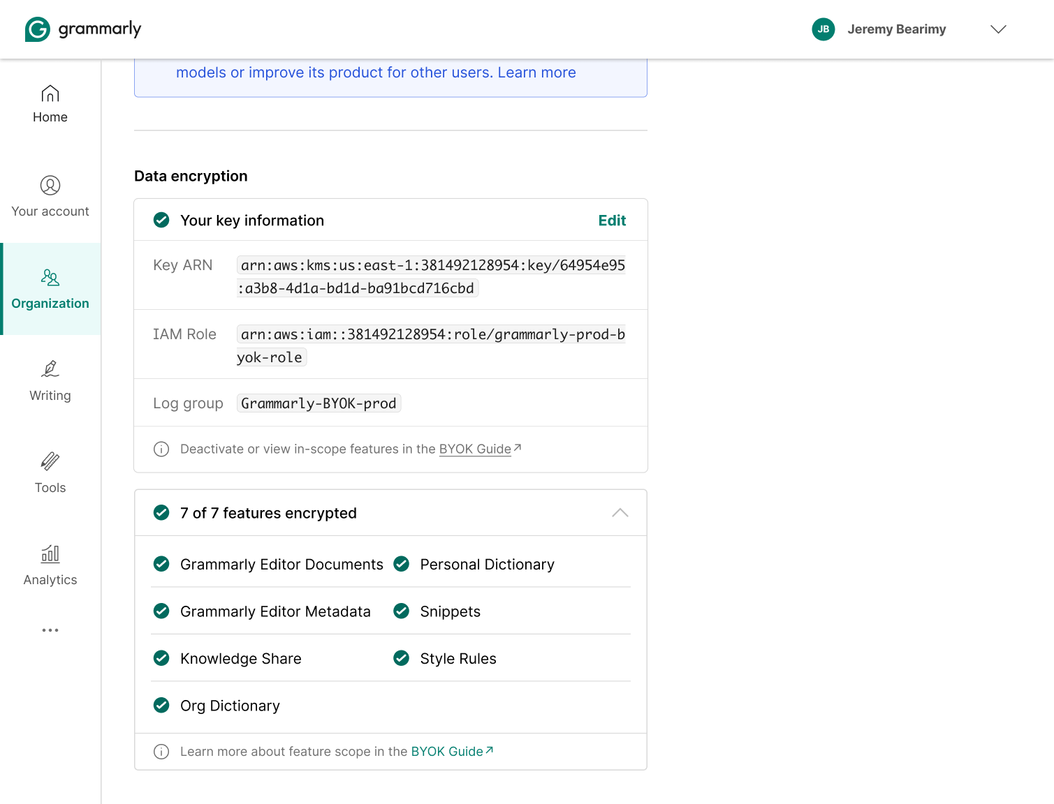
The self-serve flow started with an early concept I brought to drive alignment, a file-upload model to get the team's eyes on the experience before we locked scope. That design did its job: it quickly surfaced the real constraint, BYOK users need to provision a key in AWS KMS first, before handing anything to Grammarly. The concept got us to that discovery early. What shipped was a Key ARN entry form with a persistent link to the implementation guide.
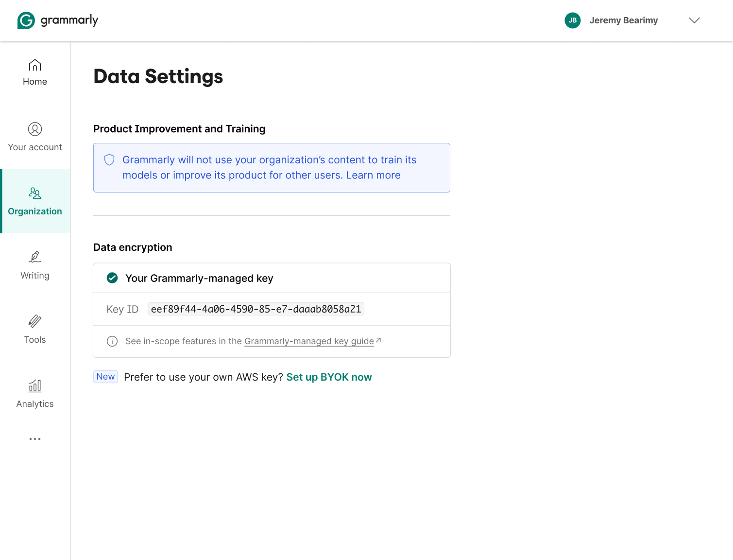
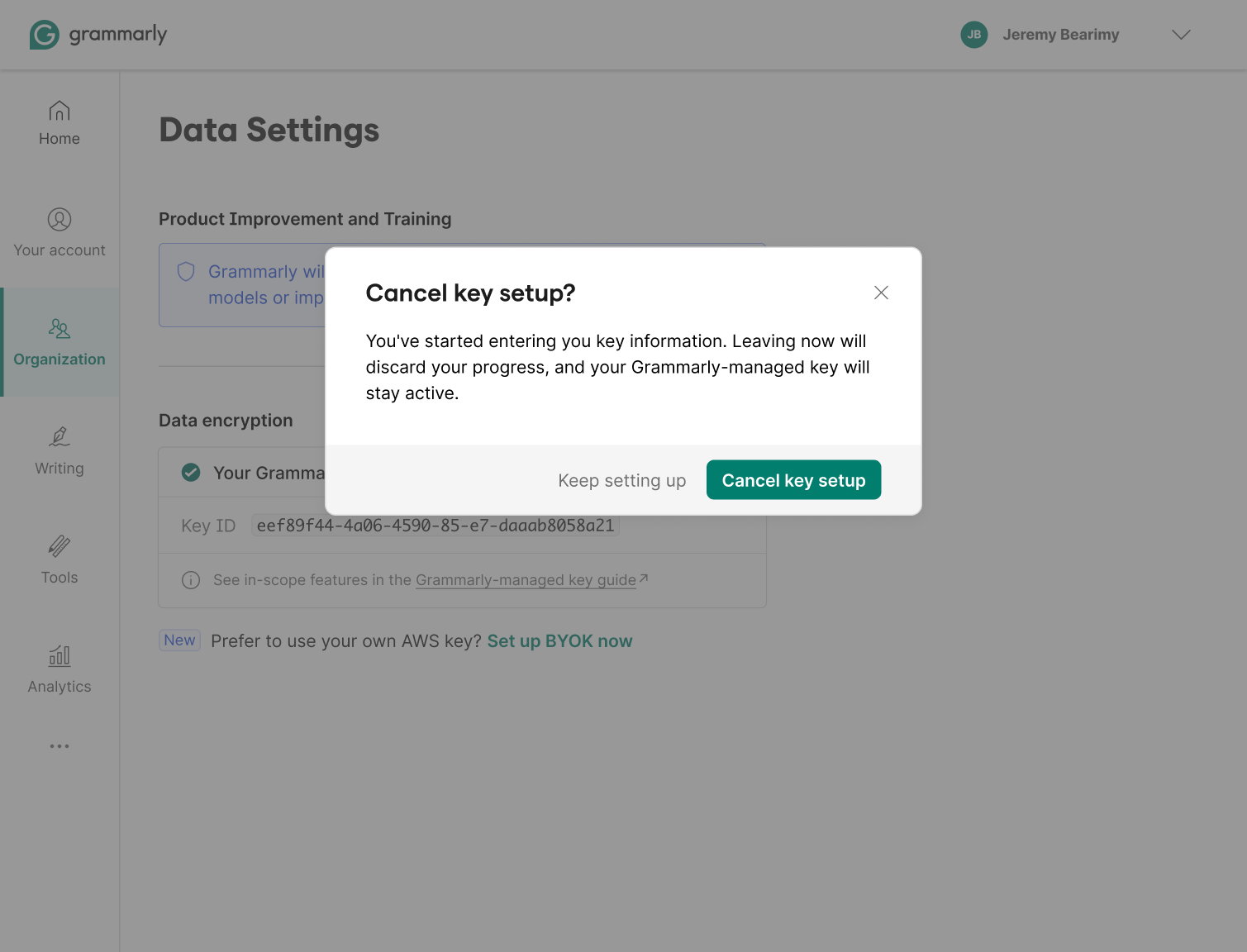
The entry point shows the Grammarly-managed key active, with a "Set up BYOK now" CTA. Before asking for any credentials, an explainer walks through how the process works and keeps the Grammarly-managed key active as a safety net until setup completes, no gap in data protection during the transition.
The active state
These explorations pushed toward full transparency once BYOK was running, key details, IAM role, log group, an in-progress encryption status, and a per-feature manifest. The assumption was that the key would change states and users would need to track it. That assumption didn't hold up. The key doesn't change states, so surfacing all that status was over-engineered. The team moved away from it on feasibility grounds.
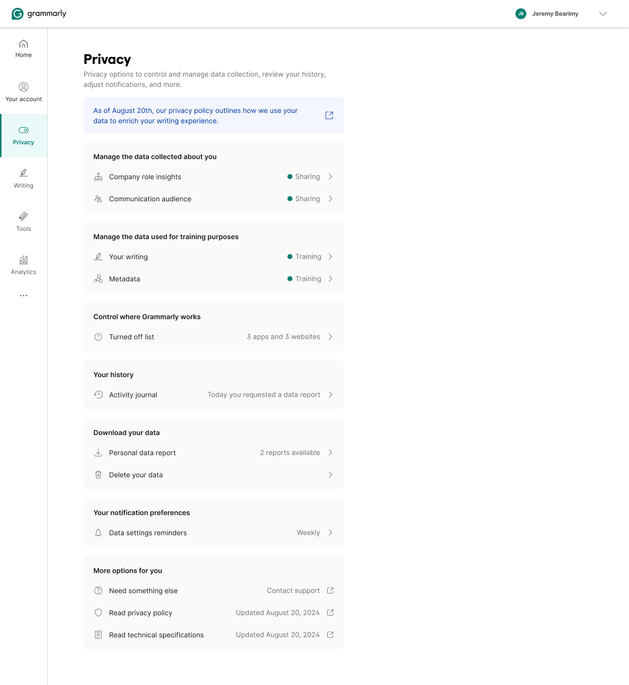
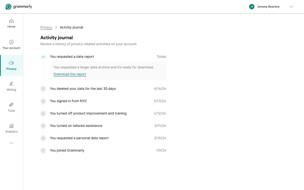
Privacy Hub
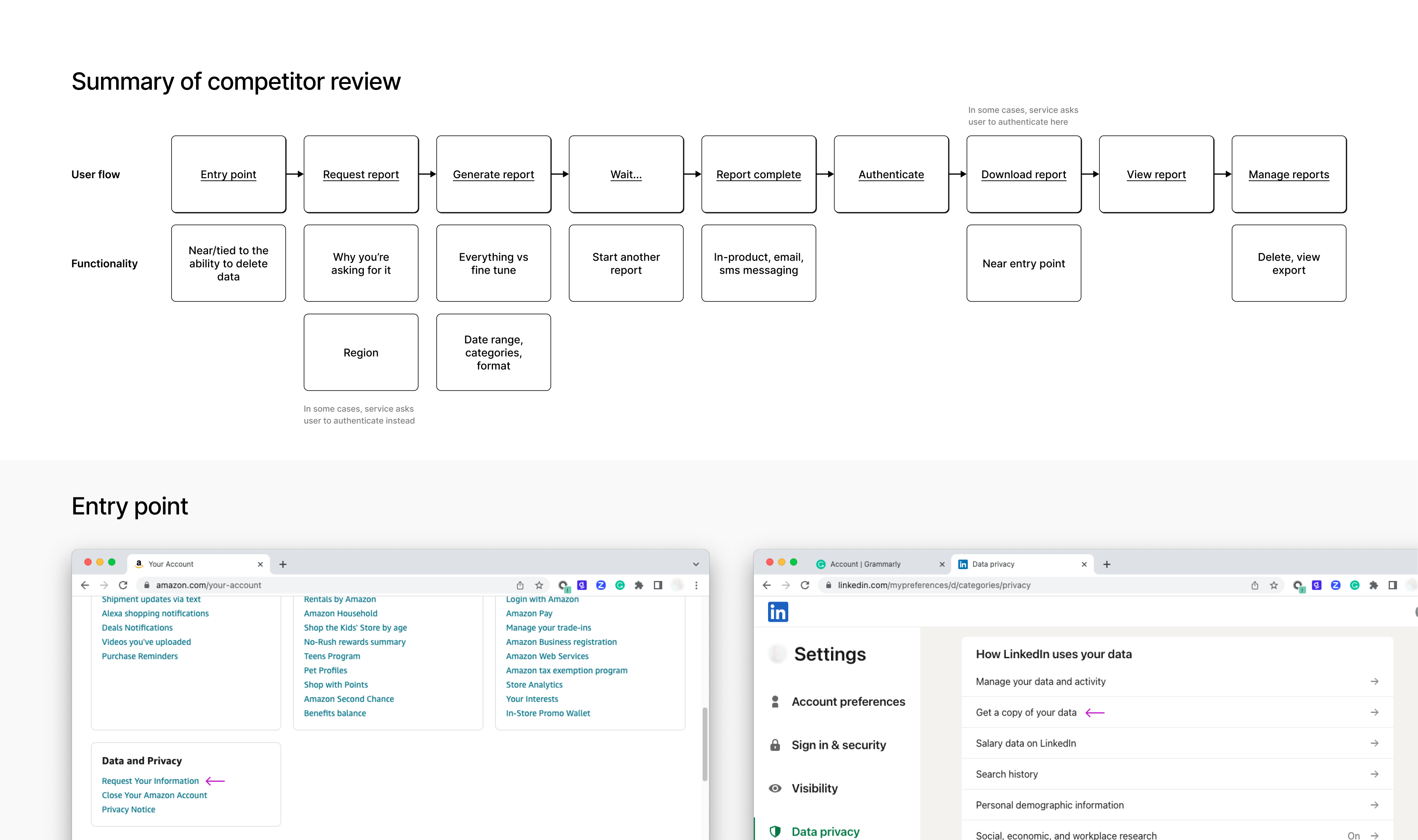
A concept that didn't ship. The existing privacy controls were organized around features, toggles scattered across settings, each owned by the team that shipped the feature. If you wanted to understand what Grammarly knew about you, there was no single place to look. The question we started with: what would it look like to organize privacy around data instead of features?
Before designing anything, I mapped how competitors handle data transparency, entry points, report request flows, download mechanics, and deletion. The pattern: most companies bolt a "Download my data" link onto their settings page and call it done. The user flow is long, often opaque, and disconnected from the controls that actually matter.
The reframe: make data the first-class entity. Not "turn off Writing Suggestions," but "here's what's collected about your writing, here's what it's used for, here's how to limit or delete it." Features become downstream of data. Turn off a data category and the features that depend on it respond. That organizational logic changes what a privacy setting even means.
Outcomes
CDTC launched June 20, 2024, the same day Grammarly emailed 70 million users about the privacy policy update. A few months later, a random LinkedIn post about Grammarly's data practices surfaced in the comments with a screenshot of exactly the EU state we'd designed: "Since you created your account in the EU or UK, Grammarly will not use your content to train its models." The reply: "Ah, brilliant." The design was working in the wild.
The CMP framework scaled across product teams without needing design on every feature. Privacy became a first-class surface, its own nav item, not a buried subsection. BYOK opened enterprise procurement conversations.
Background
Three brands, same product. Grubhub, Seamless, and Eat24 shared most of their UI but had no shared system. Components were duplicated, patterns drifted, every team solving the same problems independently. The first step was to centralize into a living style guide that could serve all three brands without losing their identity.
Grubhub didn't have a systems-first design culture when we started. Cookbook helped create one, and over time the system became a driver of product and design strategy.
The failed first attempt
The first attempt didn't make it. I built before I sold. No strategic framing, no executive cover, no clear story for why the org should invest beyond "the components will be nice." Product teams modified patterns during feature work without much governance. The intangible benefits, communication, velocity, quality, never got quantified, and leadership saw no return.
The second attempt started differently. Senior design leadership framed the work strategically before any components were drawn. A VP funded a dedicated team. Once that scaffolding was there, the system itself could be built.
Foundation
The system hierarchy came from interviews, how designers and engineers actually started features, where they got stuck, and what information they wished they had. Those conversations shaped every structural decision.
What it contained
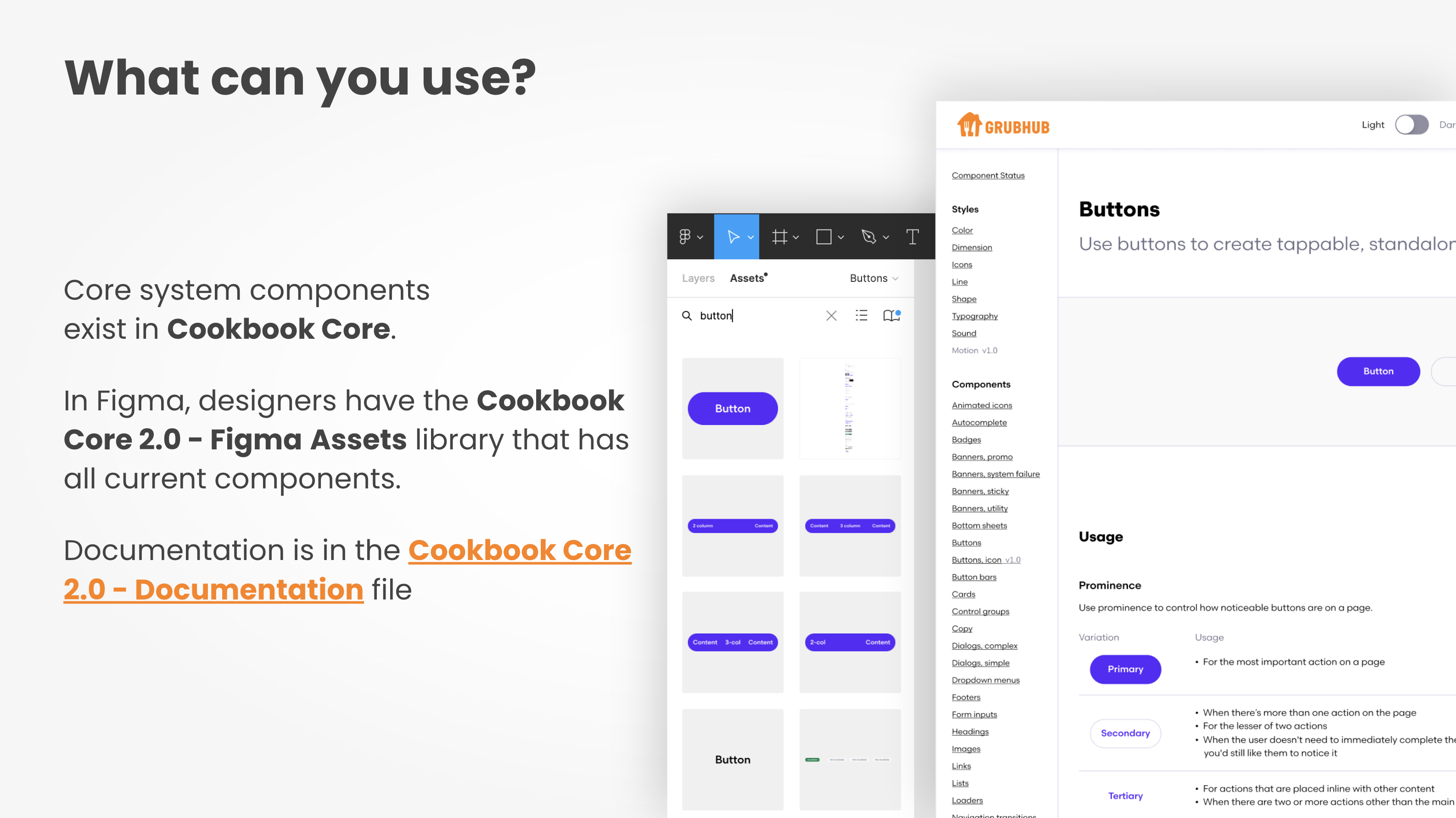
Cookbook covered every layer of the stack. Style foundations: typography, semantic and perceptual color (light and dark), shape, dimension, line, icons, sound. Layout: device breakpoints, units and measurements, grid, spacing, page templates. Accessibility guides. 45+ cross-platform components.
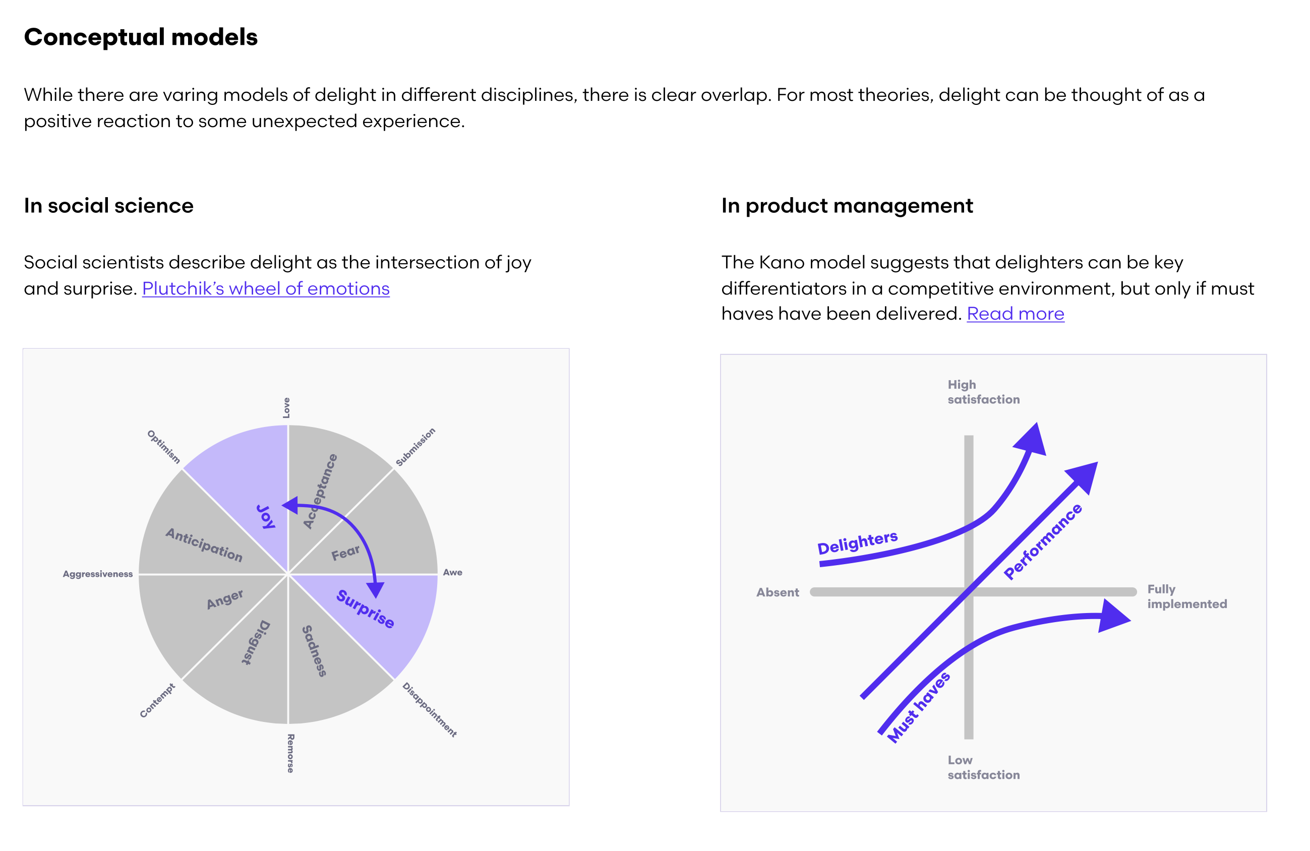
Above the component layer: Strategies, six higher-order docs covering how components work together in real product scenarios. Navigation, Search Navigation, Sheets vs. Dialogs, Forms, Connectivity & Outages, and Delight. Not just what to use, but when and why.
Contribution had a formal five-stage process, Intro, Discover, Suggest, Support, and Document, so any team could add patterns without bypassing quality standards or bottlenecking the systems team. We negotiated a 15% engineering tech debt budget with leadership to fund cross-platform delivery. Governance designed in, not bolted on.
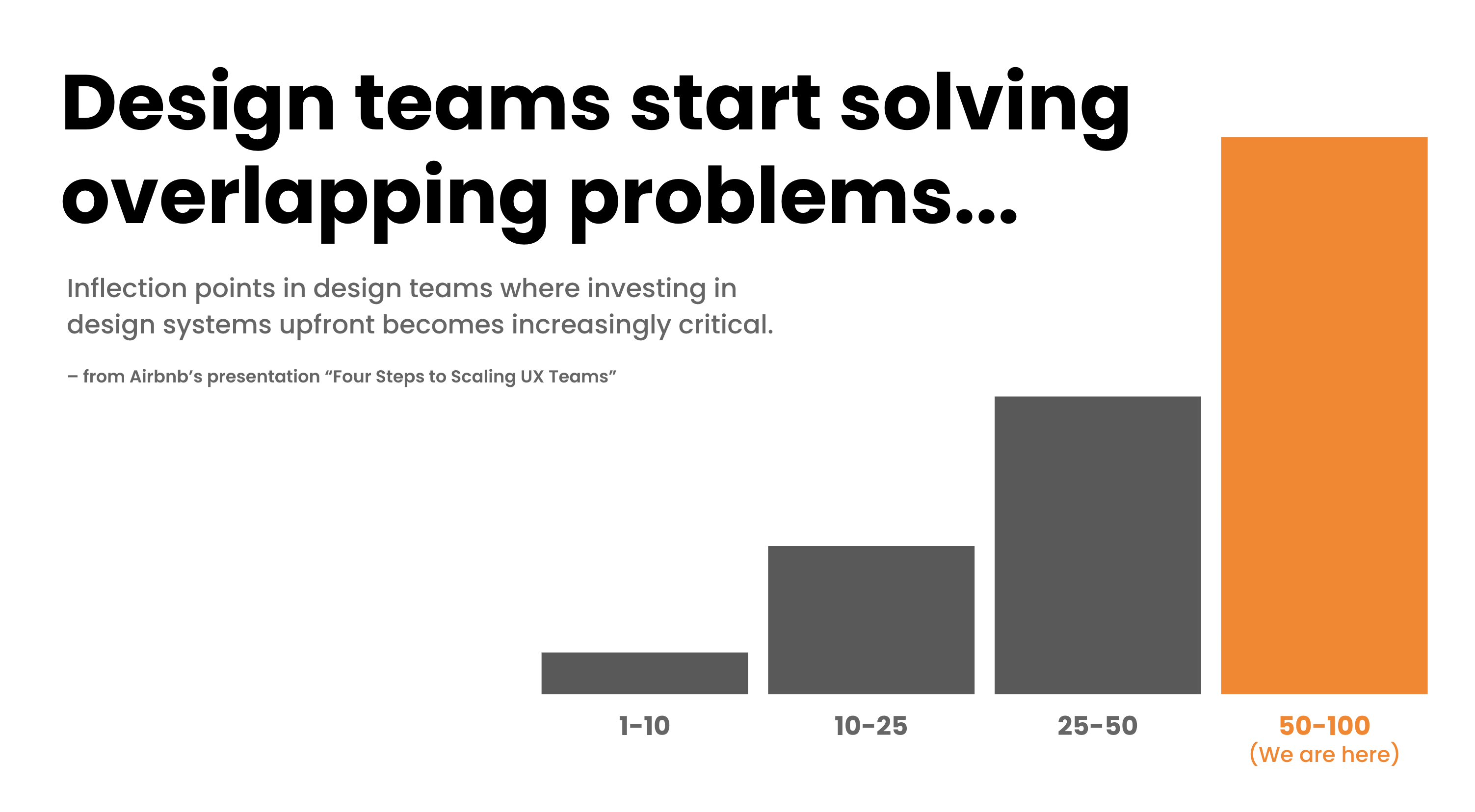
Adoption
At 50+ designers, a system needs more than good components, it needs education. I structured onboarding around the questions people actually ask: what problem does this solve, what is it, how do I use it.
A services menu helped. It spelled out what the systems team would do for product teams (embedded, light-touch, or consuming) versus what teams would do for themselves. The ambiguity that had killed the first attempt was the thing the menu was designed to remove.
OKRs were tied to adoption and satisfaction, not component count. Counting components shipped is vanity. The numbers we cared about were whether designers and engineers felt the system was helping them ship faster.
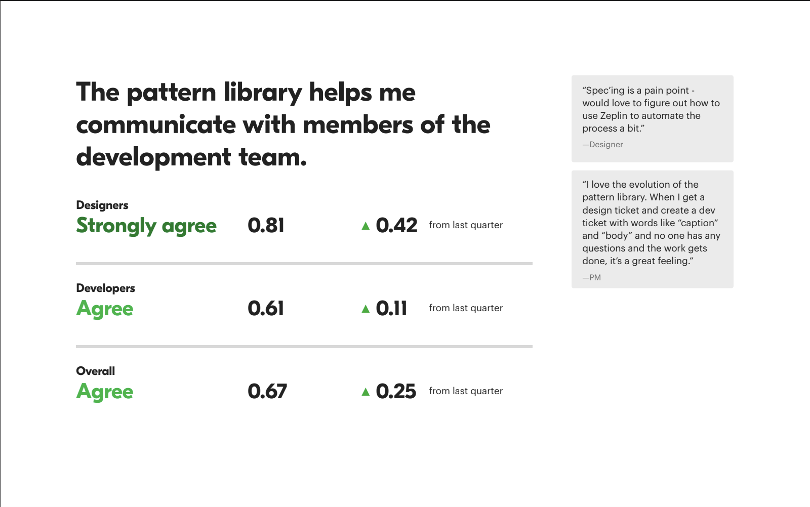
Impact tracked through quarterly surveys, designer-to-engineer communication, documentation quality, and development velocity. Average satisfaction moved from 0.38 to 0.52 across the categories we tracked.
Outcomes
Two years in: 39 cross-platform patterns, a full year of engineering time saved, conversion goals exceeded. Experiments informed by Cookbook standards drove +5,260 DAGs and +$57.6M in annual restaurant revenue.
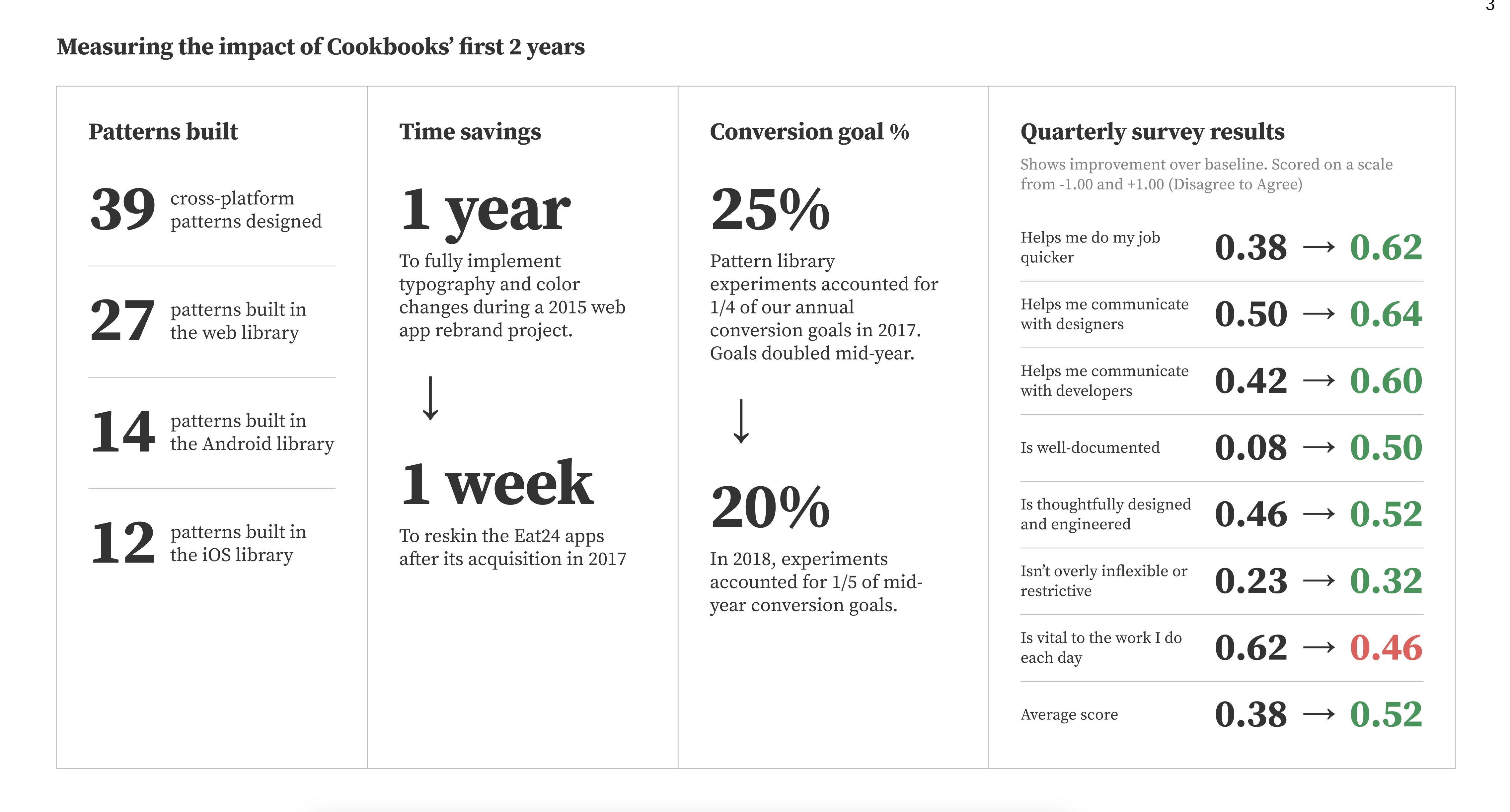
The 2015 Grubhub rebrand took a full year to roll out without a system. After Cookbook, the same kind of work for Eat24 took a week.
The contribution model, more than the components, was the thing that stuck. Cookbook survived three head-of-design changes and the Eat24 acquisition because the path for a product team to add a pattern stayed the same regardless of who was running design.
The longer-lasting influence was the people. Every designer who worked on Cookbook went on to lead design systems at other companies, Spotify, Pinterest, Nike, Zendesk, and others.
Scale
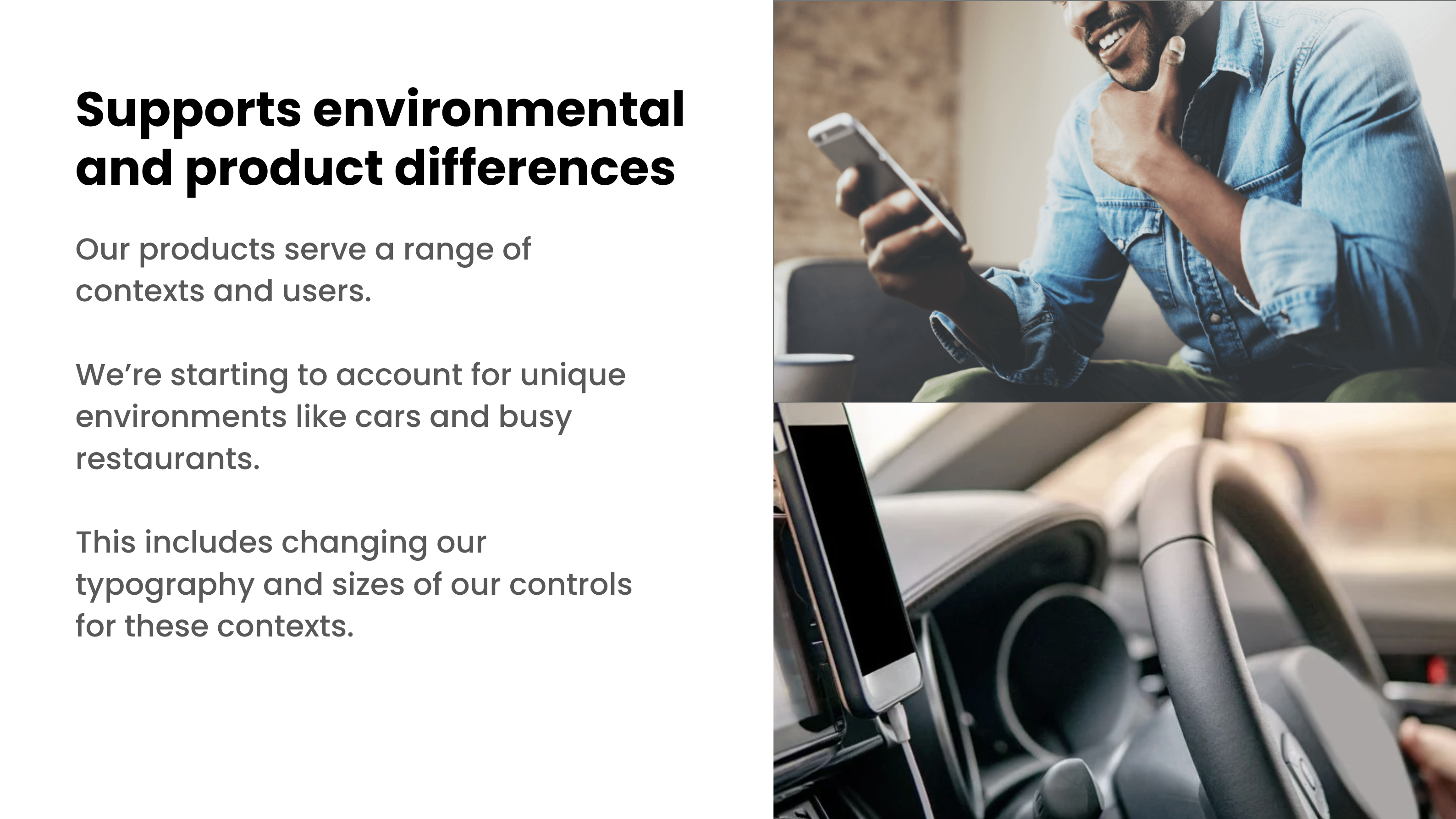
Project Sunburst expanded Cookbook from the consumer app into the full three-sided marketplace, Diner, Restaurant, and Driver. The driver app lives in a car. The restaurant app lives in a busy kitchen. The system adapted: typography scales and control sizes tuned to each environment.
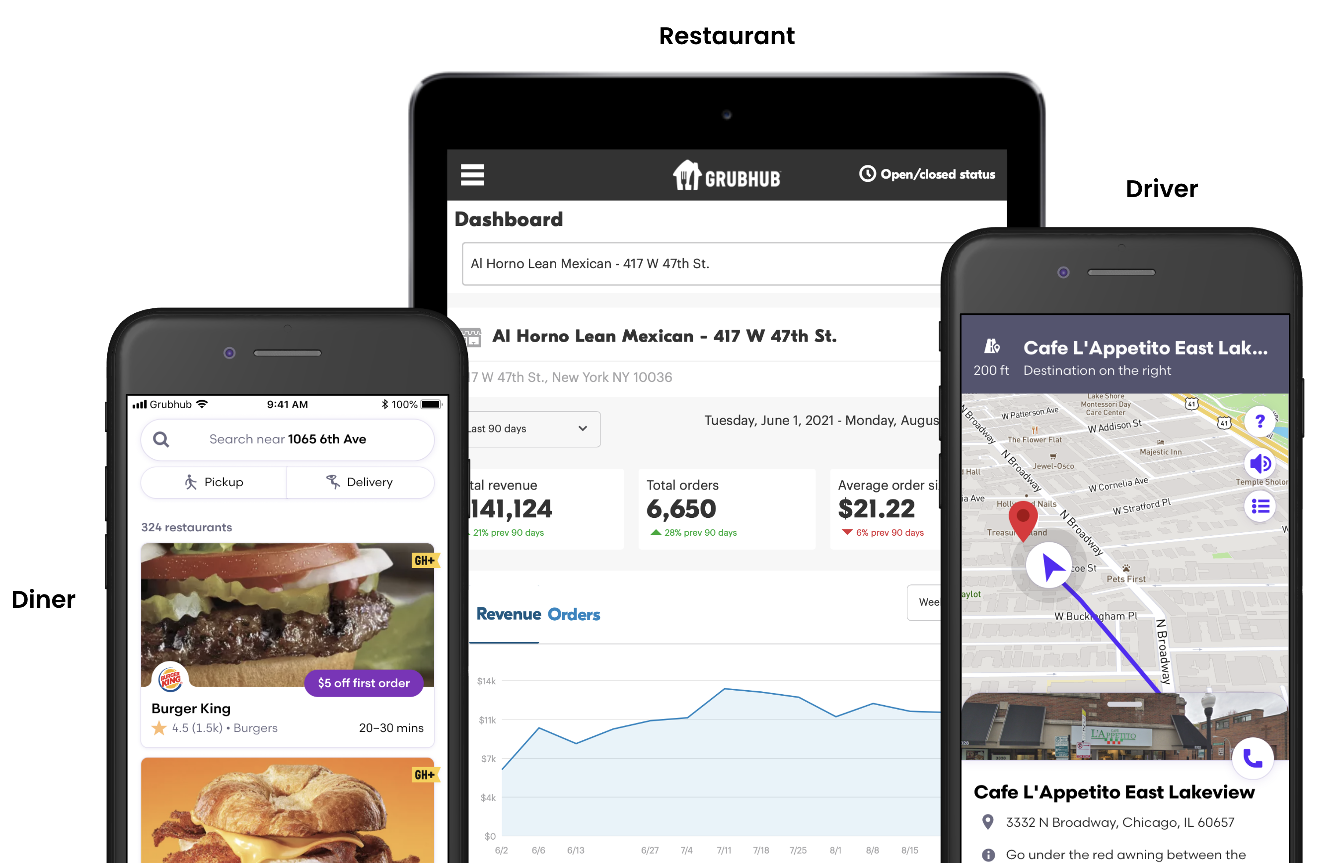
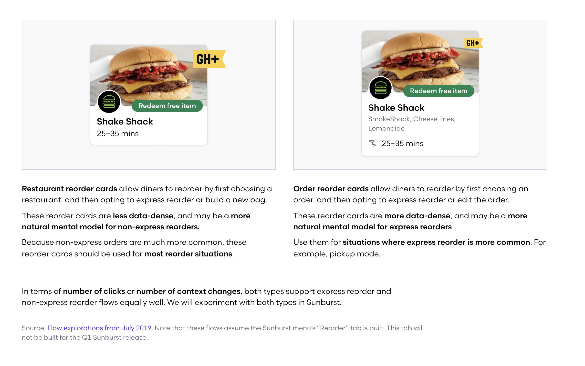
Product sub-libraries, Diner, Restaurant, Care, and Driver, extended Core with app-level components. Not just overrides: a reorder card in the Diner library knew about ratings, ETAs, and delivery fees. The same structure in Care knew about case status and support context. Core components wired to real product data.
Web, iOS, and Android, all consistent. iOS and Android each had Storybook-style component libraries so engineering could test states and validate changes without opening Figma.
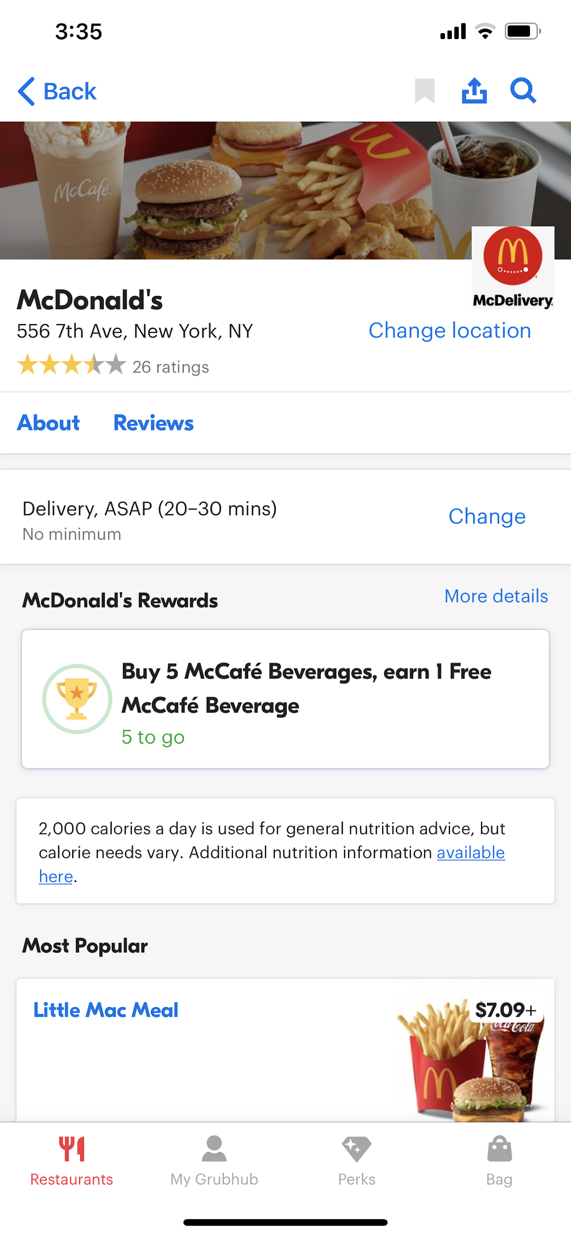
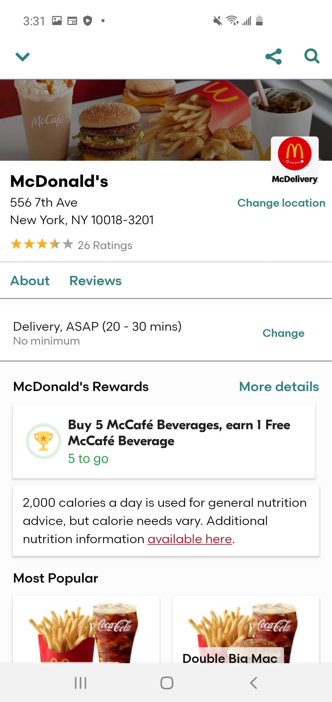
Background
DoorDash and Uber Eats were pulling ahead, not just visually, but structurally. Grubhub's apps were organized around how the product worked, not how people order food. Navigation cluttered with tabs that didn't earn their place. Pickup buried. Reorder buried. Every action a full-page navigation push. The head of product made the call: two designers, shape the redesign. I'd never heard that mandate before.
The room
The systems team, designers who'd been at Grubhub long enough to know the product inside and out, spent two months working out the architectural direction. Full IA, full schematics, every pattern decided before anyone else touched it. Then we handed it to the team.
Navigation
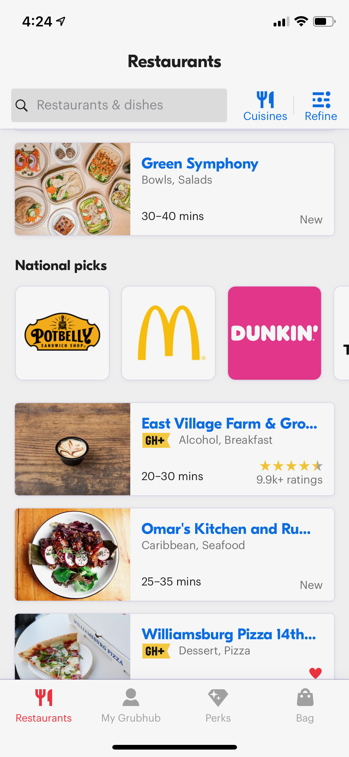
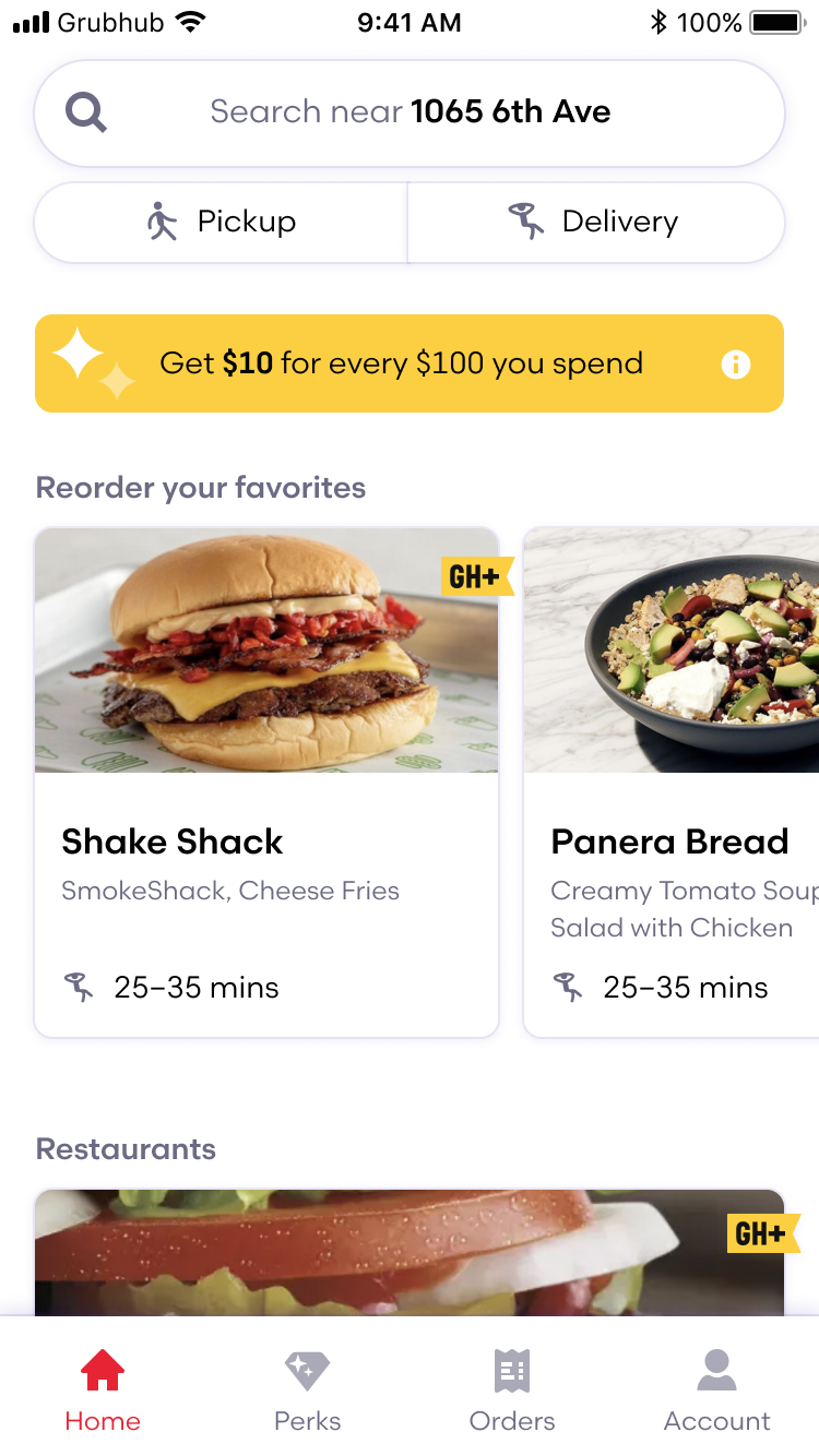
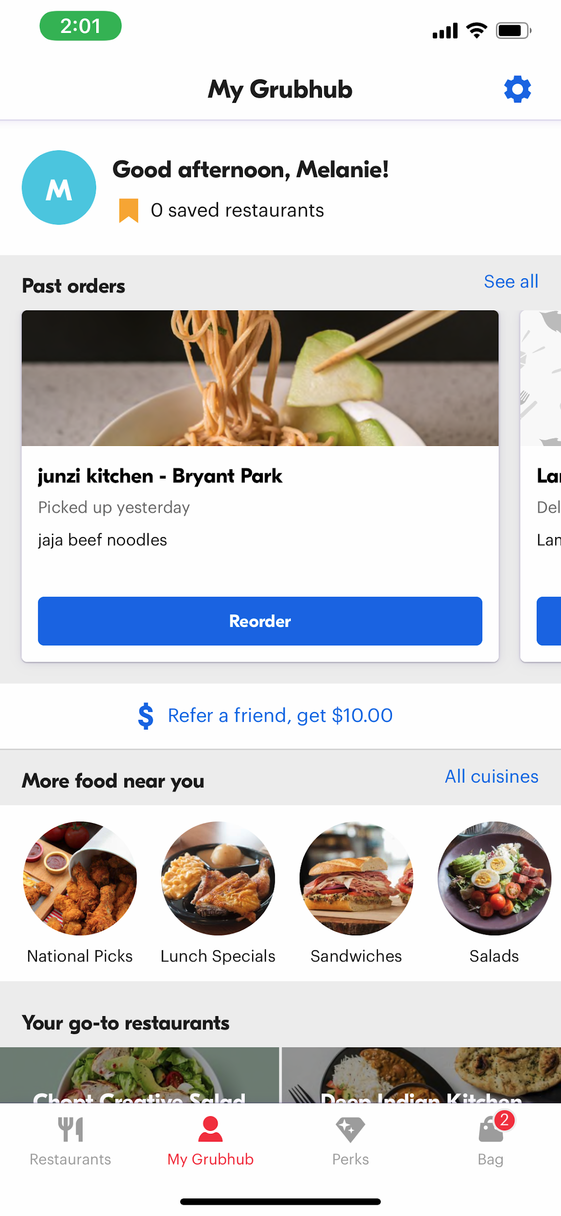
The existing bottom nav had four permanent tabs: Restaurants, My Grubhub, Perks, Bag. The bag tab showed up even when it was empty. My Grubhub was an unfocused dump. New diners and returning diners landed in the same generic restaurant list with no personalization.
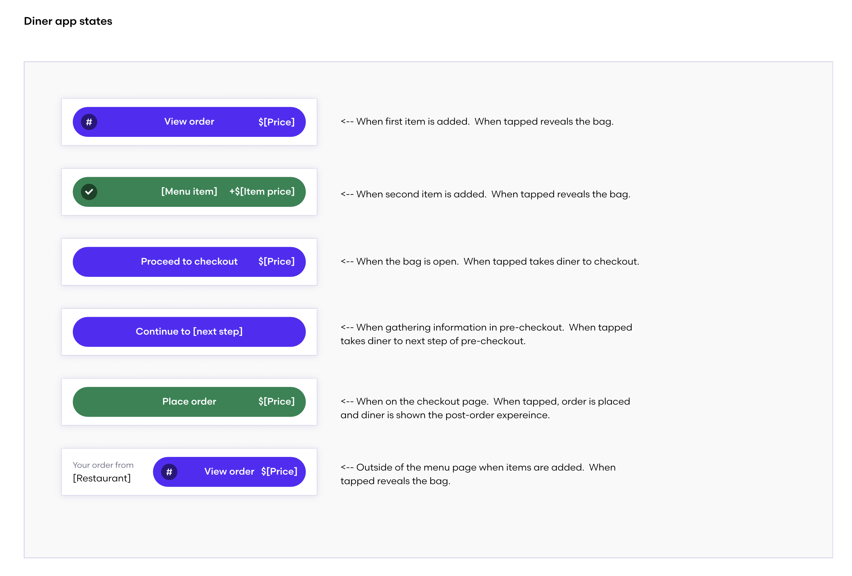
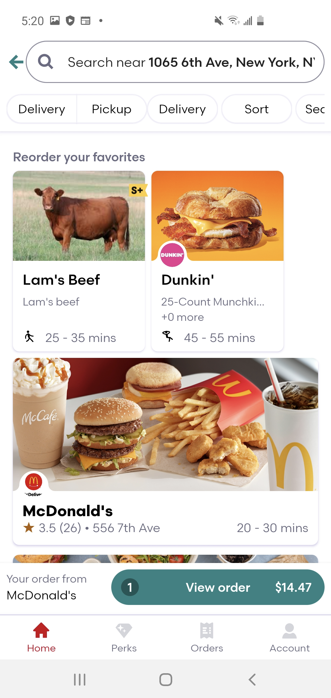
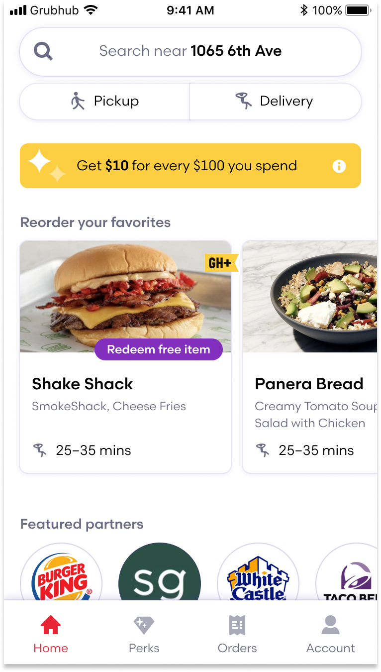
We collapsed it to Home, Perks, Orders, Account. The bag tab gone, replaced by a persistent order footer that follows the diner across the app, only appearing once a cart exists. Every tab had to earn its place. Home became a personalized landing: pickup and delivery exposed directly at the top, reorder favorites surfaced as one-tap cards, no longer buried in a separate tab or behind the address field.
Sheet architecture
No sheet system in the baseline, and every action pushed to a full new page. We designed a layered sheet system: filters, sorts, and the menu all slide up from the bottom. Fast, one-handed, interruptible. I prototyped the transitions in Principle before anything hit engineering.
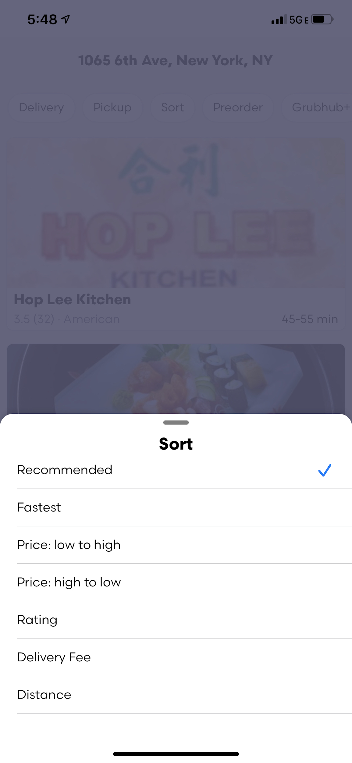
Sorts and filters got rationalized at the same time. Six sort options that mattered, relevant, price, rating, distance, ETA, and delivery fee. Deprecated the ones that didn't pull their weight: restaurant name sort, delivery minimum, rapid pickup filter, pickup distance slider. The filter panel simplified accordingly.
Reorder
In the baseline, reorder lived in the My Grubhub tab, a separate destination with extra steps between you and whatever you had last week. We moved favorites to one-tap cards on the Home screen. No tab switch, no decisions, one tap.
Menu + visual language
One design principle: Purposeful. Strip noise, fewer greys, tighter interactive color, and better contrast. The menu went from a full-page push to a sheet that slides up from the bottom, covering the nav tabs. Same UX underneath, radically different feel.
The rollout
Before the wider launch, we stitched the full end-to-end flow and produced a sizzle reel with the help of a motion designer we called Sizzle. The CEO and founder of Grubhub saw it.
Rollout was phased, 5% smoke test scaling to 50%, with conversion, reorder rate, and launch time tracked at each gate. Grubhub was an experimentation company, but you can't A/B test a brand new experience the same way you gate a button color.
Outcomes
Navigation, search, filtering, and reskinned light and dark modes all shipped. The patterns ran in the driver app, restaurant app, and web. One of the most impactful experience pushes in Grubhub's history at that point, presented to the C-suite, extended across every major surface.